THE WHAT
In a world where technology bridges gaps and simplifies life, there exists a platform that transforms the way we handle money. Imagine having all your financial needs met in one place, where your phone number becomes the key to unlocking a myriad of financial services. This isn't just about making payments or transferring funds; it's about creating a seamless financial ecosystem. From spending to saving, borrowing to receiving, everything you need is consolidated into this handy digital space. It's more than a bank—it's a mission to include the unbanked in the financial mainstream, turning traditional banking on its head and making financial inclusivity a reality for everyone.
THE CHALLENGE
Component Library
High Fidelity Designs
Usability Testing
TEAM
Product Manager
YEAR
2018-2020
Developers (iOS and Android)
Web Developers
OUR BIG PLAN
RESEARCH & DISCOVERY
Initially, our team pinpointed several clear aspects where the existing software fell short, yet we craved deeper insights—specific, quantifiable feedback from our users to unveil potential efficiency enhancements. And time was of the essence. Standing at a critical juncture, we pondered our next move.
To gather the insights we needed, we embarked on a comprehensive user study, interviewing over 100 users. We meticulously observed and documented their interactions with our product—from signing up and making transfers to funding their accounts and navigating through any app-related challenges.
After completing development and conducting thorough internal tests with our company's staff, we were ready to launch the product and seek public feedback. The official release was slated for October 10, 2019.
The launch was a critical moment for us, as it would reveal the market's reception to our efforts.The positive feedback on the app's experience soon after its release was incredibly affirming. It confirmed that our dedication to creating a user-centric product had paid off. This success was a clear indication of our team's hard work and innovation, proving that we had achieved something remarkable with our new app.
Faced difficulties in understanding the process to top up their wallet.
Expressed frustration over the lengthy process required to execute an action.
THE REDESIGN
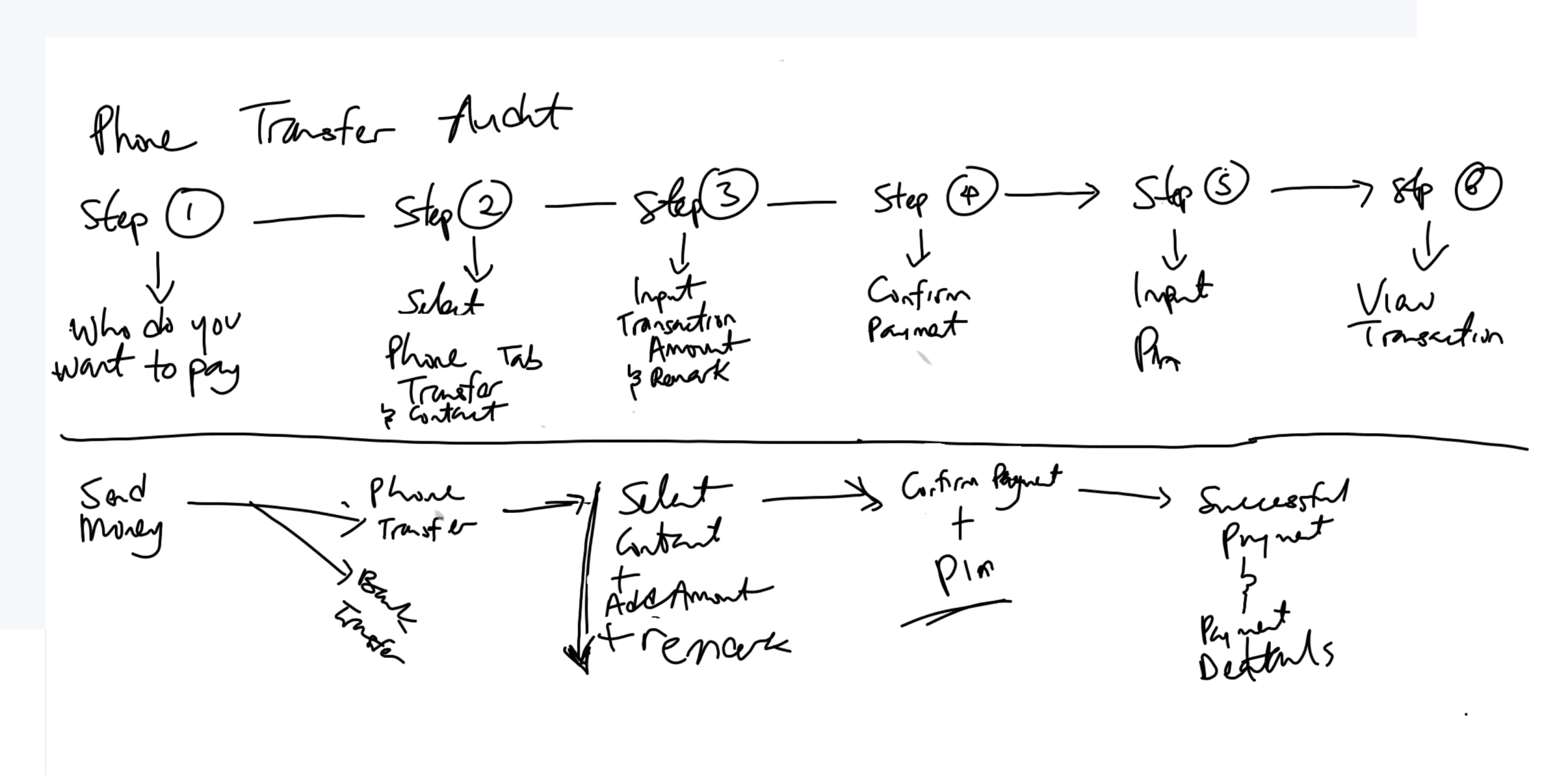
I prioritized stripping away outdated content and streamlining actions for quicker completion before introducing any new elements. My attention then shifted to rebuilding what I believed was the core section, the homepage. However, to ensure a smoother redesign process, we first developed a series of flow charts and sketches.
HOMEPAGE OVERHAUL
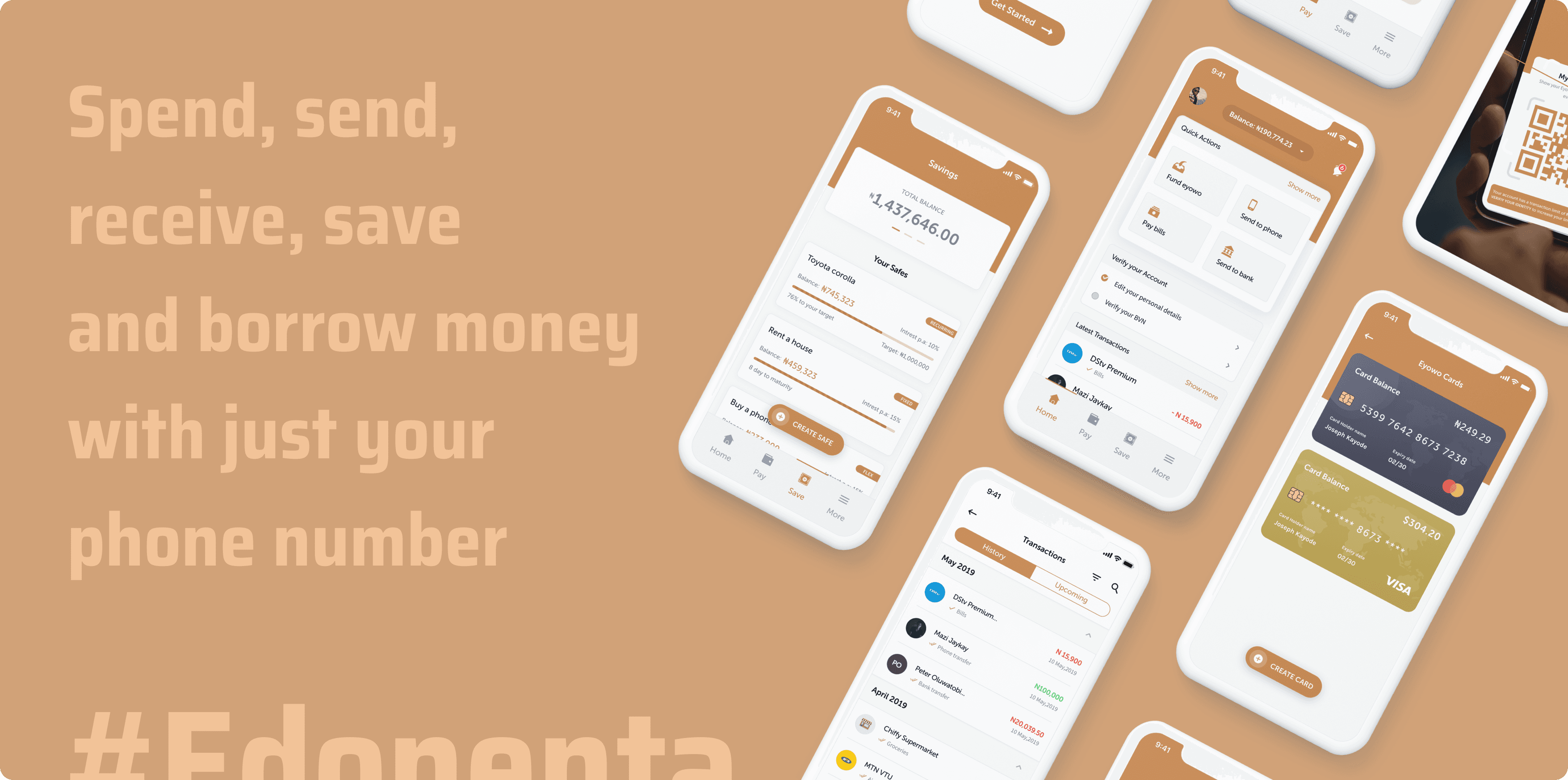
Our user interviews, both internal and external, revealed a significant challenge: without assistance, most people struggled to understand the homepage's functionality. This issue was critical because if users were lost at the start, the value of subsequent pages and features would be missed, rendering the app ineffective. To address this, we restructured the homepage into six distinct sections:
Top Nav: Offers a concise snapshot of the user's profile, balance, and notifications, including a balance button that triggers a modal for hiding or showing the balance—a highly requested feature during our research phase.
Quick Actions: This section solves the issue of finding essential functions easily. Users can now quickly spot and execute actions, eliminating the need for extensive searching. The arrangement of these elements aligns with the company's priorities.
Account Verification: Here, users are prompted to update their information to unlock full platform access.
Transactions: Recognizing the significance of transaction history in managing financial health, this area displays the three most recent transactions, offering users immediate insight into their financial activities.
Navigation Drawers: To overcome the previous version's navigational challenges, we introduced a bottom navigation bar. This feature provides straightforward access to various app functions, enhancing user navigation.
Expense Tracker: This new feature includes an expense tracker that shows weekly spending patterns, helping users to better manage their finances.
Increase in app download from the launch on October 2019
In the app stores, the average user review score rose from 2.1 to 4.1.


