Case study Tangerine · 2020 to 2022
One app for every money decision.
Tangerine Africa had insured customers and built savings plans the traditional way for years. I owned the UX for the web and mobile experience that brought banking, saving, insuring and investing into one app.
- The problemA traditional insurer had to become a modern money app, without overwhelming people new to doing finance digitally.
- What I didOwned UX for web and mobile: research, a clutter-free home page, in-flow education and a shared component library.
- The result35K+ users and £4M+ processed within six months of launch.
Tangerine’s figures for the first six months after launch. They reflect the whole product and team, not design alone.
01 Context
Banking, saving, insuring and investing, in one place.
Tangerine Africa is a single app for banking, saving, spending, insuring, investing and managing money. Customers manage their own finances in it, and business owners can offer services such as insurance and pensions to their employees.
I was the UX designer on the web and mobile products, working with a product manager and with iOS, Android and web developers.
02 The challenge
Years of insurance, none of it digital.
Tangerine had spent many years insuring customers and building savings plans through traditional channels. The goal was to digitise that whole process, and to add new capabilities, so customers could make every financial decision inside the web and mobile app.
That created a design problem. One app with that many products can easily turn into a wall of options, for people who may be doing finance digitally for the first time.
03 Research
38 conversations before any screens.
We researched who the clients were, what they needed and why, how they handled banking and financial tasks, and how they reacted to the concept. I helped schedule 38 participants for calls on Teams, Zoom and Google Meet.
From 38 interview participants.
What people wanted
Simple ways to save and invest
Savings options tailored to specific goals, investment programmes to help reach them, and higher-yielding investments.
Security that is easy to set up
Security that works without being hard to use.
Guidance and education
Financial guidance, and a platform that recommends products from cash flow, income and goals.
Credit and pensions
Simple loans at lower rates, a pension they can pay into, and no limits on foreign transactions.
04 Design decisions
Four calls that shaped it.
The research pointed one way: people wanted to find the product they came for, and to understand it before trusting it.
- 01
Show every product, hide the clutter
The constraintOne app held banking, saving, spending, insuring, investing and money management, and the risk was a screen full of options.
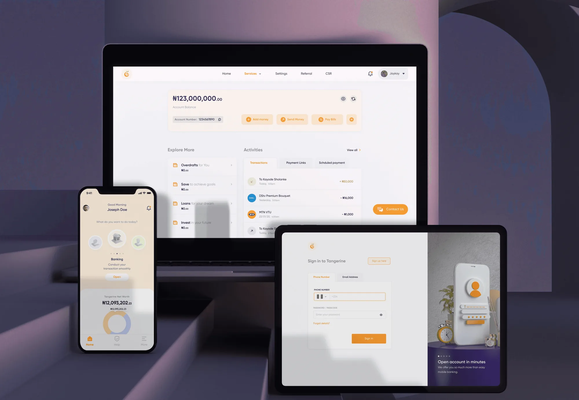
What I choseA clean home page that lists every product plainly, with extra features kept out of the first view.
What it costFeatures that are not on the home page sit one step deeper, so some people take a tap longer to reach them.
- 02
Teach inside the flow, not outside it
The constraintMany people see insurance as a product for older people, and many customers were new to doing finance digitally.
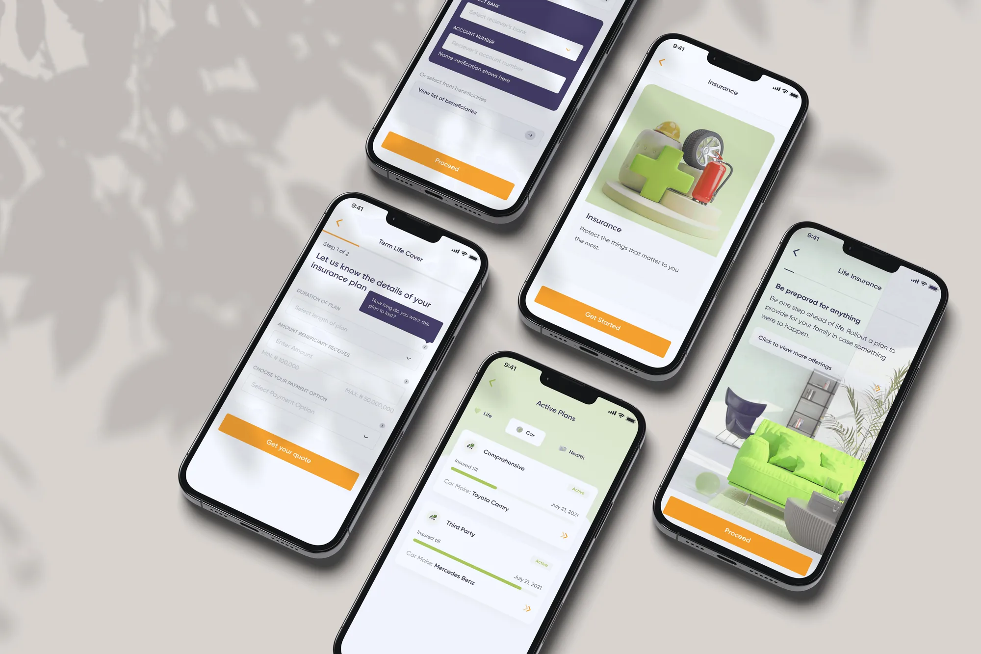
What I choseTooltips and tutorials that explain each action where it happens, and Tangerine Hub, a library of articles for reading more.
What it costMore content to write and keep accurate, and more copy for designers and the team to maintain.
- 03
Recommend, so people do not have to hunt
The constraintPeople wanted a platform that suggests products from their cash flow, income and goals, not one they have to search.
What I choseA feed that recommends products based on what customers told us they needed.
What it costIt only works as well as what we know about the customer, so it needed people to share goals and income.
- 04
One component library for web and mobile
The constraintWeb, iOS and Android were being built by separate developers, and drift between them would break trust.
What I choseA single shared component library, so the web app and both mobile apps looked and behaved the same.
What it costPlatform differences had to be designed into the system, which took more up-front work than designing each surface alone.
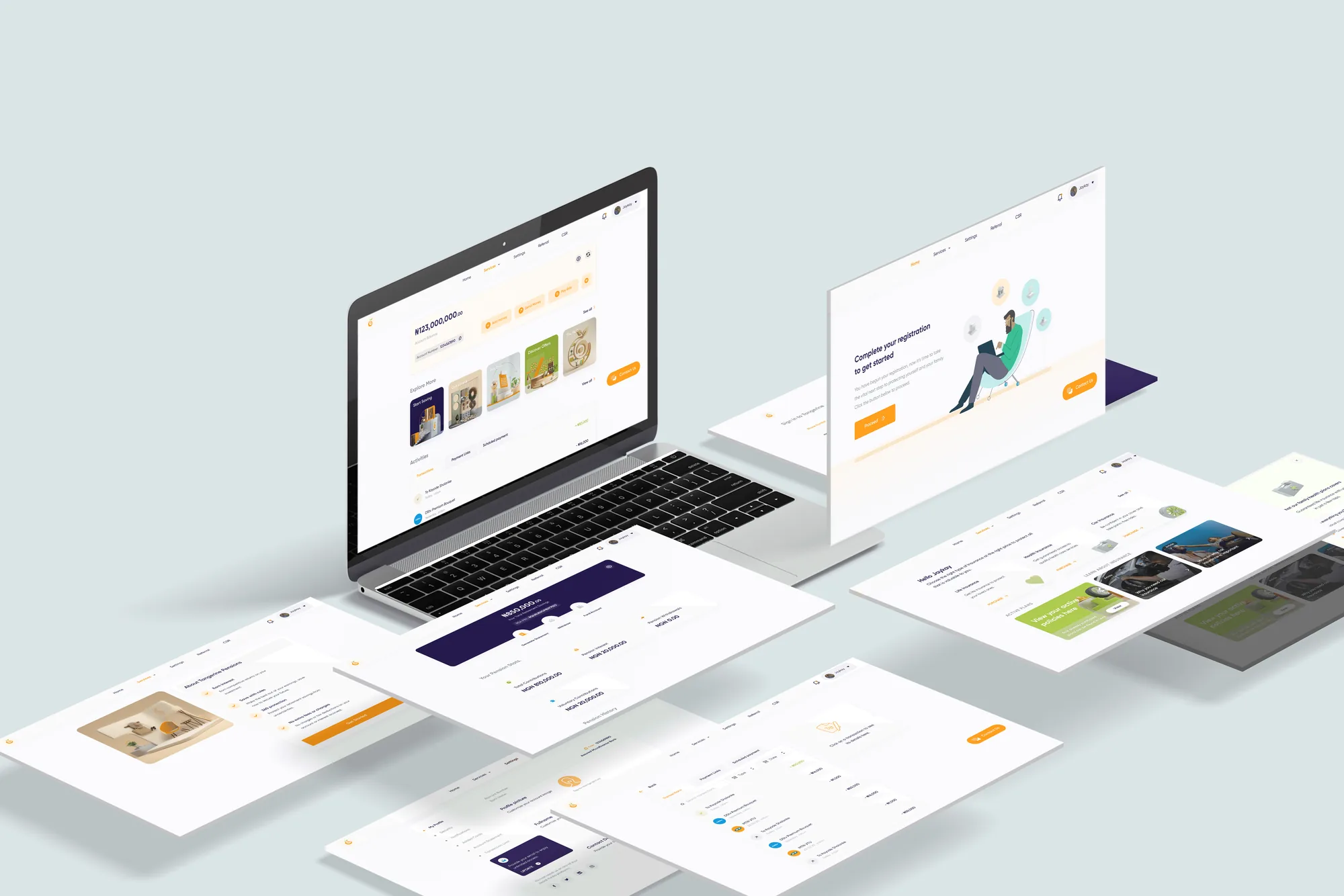
05 The screens
What it looked like.
06 Outcome
What the work changed.
The results from the first six months after launch.
Tangerine’s figures. They reflect the whole product and team, not design alone.
07 What I learned
What I took from it.
This was a product for people going through their first wave of digital change in finance.
- Set KPIs as user goals, not business goals. Business success follows user success.
- Stay invested in users’ lives, so the product adds value and avoids self-serving or harmful decisions.
- Teach in the flow. Explaining a financial action where it happens builds more trust than a help page.
- Test earlier. We did not run formal usability tests. Next time I would test the home page with first-time digital users before launch.