Case study Eyowo · 2018 to 2020
A finance app people can find their way around.
Eyowo turns a phone number into a way to spend, transfer, save and borrow. A year after launch it had become too complex to use, so I redesigned the mobile app around what people do most.
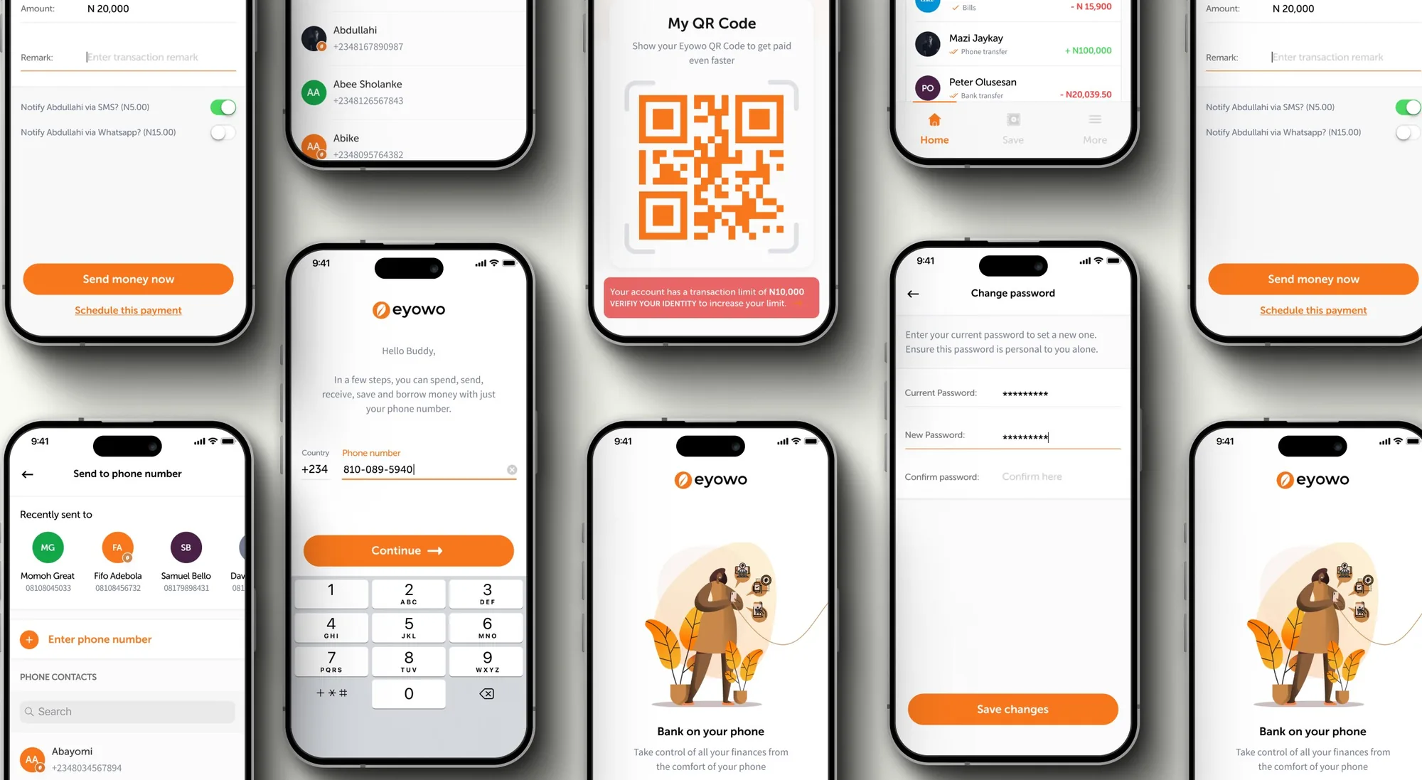
01 Context
A phone number is all you need.
Eyowo is a finance platform that brings people who have been left out of banking into the financial mainstream. With just a phone number, you can spend, transfer, save and borrow.
I joined as the UX designer, working with a product manager and with iOS, Android and web developers. My job covered the component library, the high-fidelity designs and the usability testing.
02 The challenge
The app had grown, and people couldn't find anything.
About a year after launch, the team saw that the app had become too complex. Essential features were hard to find, new features went unused, and it wasn't clear what the app was for.
So we set out to rebuild the mobile app from the ground up, with one aim: make the everyday actions simple and quick.
03 Research
We asked 100 people where it hurt.
We interviewed more than 100 users about signing up, making transfers, funding their accounts and the other things they struggled with. Four problems stood out.
From interviews with more than 100 users.
The pattern was clear. Without help, most people couldn't make sense of the homepage, and the services that mattered were hidden from them. That made the homepage the place to start.
04 The redesign
One homepage, six clear sections.
I restructured the homepage into six sections, each with one job.
- 01
Top nav
A quick snapshot of your profile, balance and notifications. I added a show and hide toggle for the balance, which users had asked for often.
- 02
Quick actions
The essential functions, placed where people can spot them and use them fast. I ordered them to reflect the company's priorities.
ScreensHomepage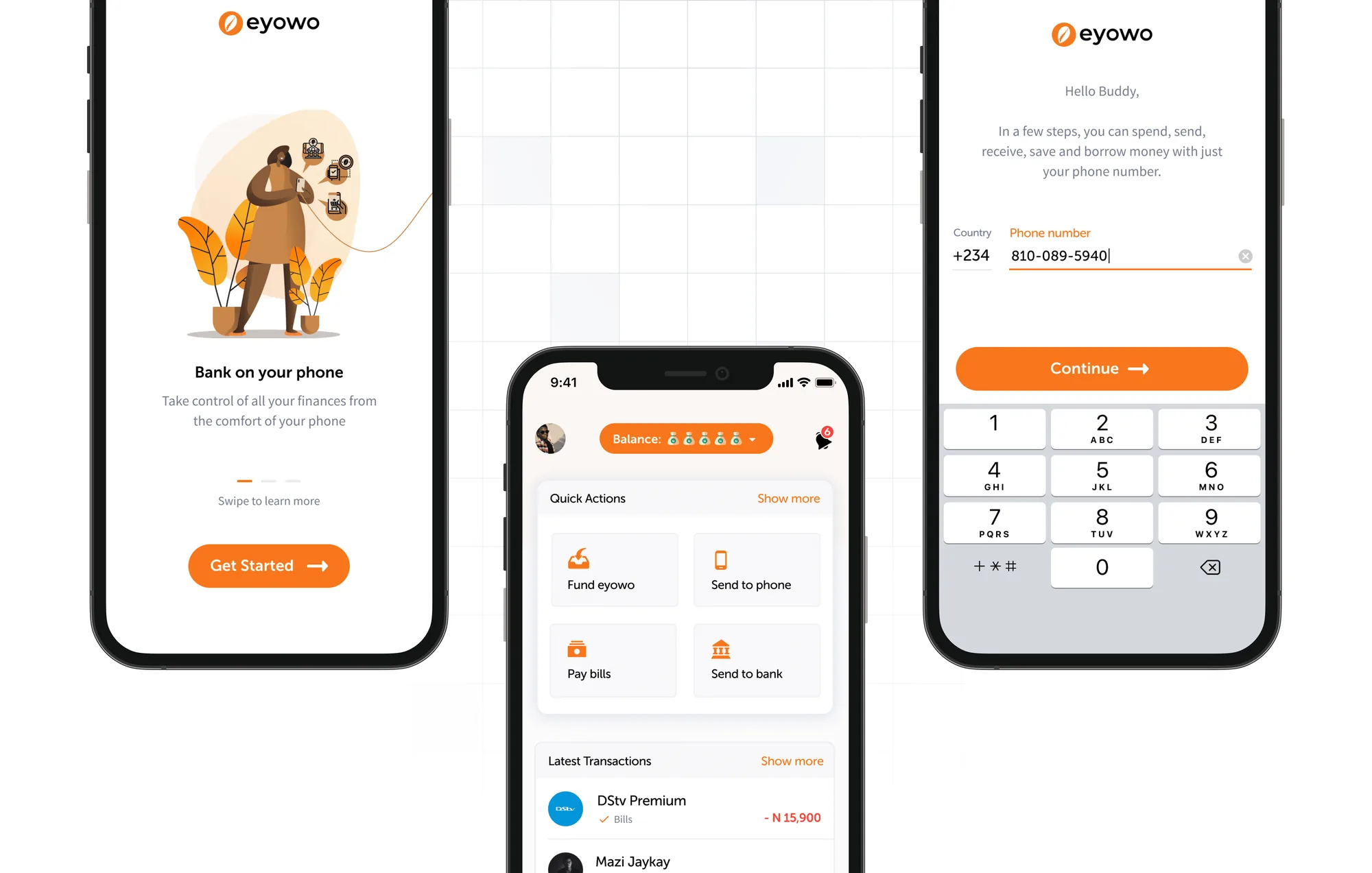
Quick actions: the main things people do, one tap away. - 03
Account verification
A prompt that asks people to complete their details so they can unlock full access to the app.
- 04
Transactions
The three most recent transactions, so people can check what just happened without digging.
- 05
Navigation
A bottom navigation bar replaced the old navigation, which had been causing difficulties.
- 06
Expense tracker
A new feature that shows your weekly spending patterns at a glance.
Screens: the six homepage sections, before and afterThe homepage before and after the redesign.
05 Design decisions
Three calls that shaped it.
Each one had a cost. These are the trade-offs I made, and what they cost.
- 01
Essentials first, new products alongside
The constraintThe company wanted new products shown first, while users needed transfers and wallet top-up.
What I choseQuick actions put the essentials where people can spot them in one tap, ordered to reflect the company’s priorities.
What it costThe essentials share the space with promotion, so the order had to be a balance, not purely user-led.
- 02
Six sections, each with one job
The constraintEssential features were hard to find, new features went unused, and it was not clear what the app was for.
What I choseA homepage restructured into six sections, so every part of the screen has a single purpose.
What it costPeople who knew the old layout had to relearn it.
- 03
A bottom navigation bar
The constraintThe old navigation had been causing difficulties.
What I choseA bottom navigation bar in place of it, so the main areas are always within reach.
What it costA new pattern for existing users, in return for easier everyday navigation.
06 Process
Tested early, reviewed often.
I didn't want to design this in isolation, so the work was checked from four directions before it shipped.
- Usability tests on prototypes, to see where people got stuck.
- Beta and staging builds shared early, so real use shaped the details.
- Stakeholder reviews with the product manager and developers throughout.
- Competitor review, to see how other finance apps solve the same problems.
07 Outcome
Shipped in October 2019, and people noticed.
The redesign launched on 10 October 2019. The results came quickly.
Satisfaction
of users said they were happy with the new experience.
Downloads
more app downloads from the October 2019 launch.
Daily active users
growth in the month after release.
App store rating
the average rating, before and after.
Among those who were not satisfied, the common themes were missing features and familiarity with the old layout. Satisfaction comes from an in-app survey. Downloads and daily active users come from product analytics, compared with the period before the redesign.
08 Reflection
What I took from it.
The hardest part was aligning priorities: what the company wanted people to see first, and what users told us they needed.
The main reason people were unhappy was familiarity, with features that had moved. Next time I would add a short guide to what changed, so the move is explained rather than discovered.
The positive feedback after launch confirmed that designing around real users was the right approach. Launch was also a critical moment: it showed us how the market would respond to the changes.