Case study Roqqu · 2022 to now
From trading app to financial super-app.
Roqqu needed to grow across Africa and Europe within six months, in two very different markets, while users were losing trust. I led design to make it simple, safe and worth coming back to.
- The problemOnboarding was hard and trust was low, just as Roqqu needed to grow.
- What I didLed design for a six-month redesign: guided KYC, a minimal design system, real-time tools and Qash.
- The resultMore people through KYC, more daily users and adoption, fewer support tickets and fraud cases, and higher satisfaction.
Product-wide results, from design, engineering and marketing together.
01 The brief
Grow across two continents in six months.
Roqqu is a regulated digital asset platform serving users in Africa and Europe. The business wanted to expand in both regions, and the goal for design was clear: a seamless, secure and intuitive experience for people in very different places, delivered within six months.
What success meant
- Grow daily active users in Africa and Europe.
- Raise adoption of the new features, starting with Qash.
I also watched support tickets and satisfaction scores, as signs that trust was coming back.
02 The users
Two regions, two sets of needs.
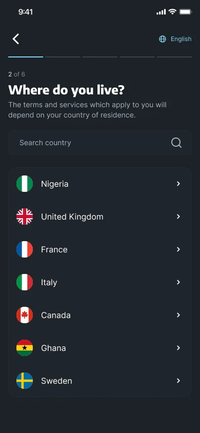
Roqqu serves people in Africa and Europe, and they don't start from the same place. Two differences shaped the design most.
Payment habits
People in each region pay, bank and move money differently, so the experience had to feel natural in both.
Regulation and verification
Verification requirements differ by region, which shaped how KYC could work.
How deposits differ
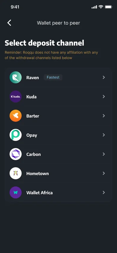
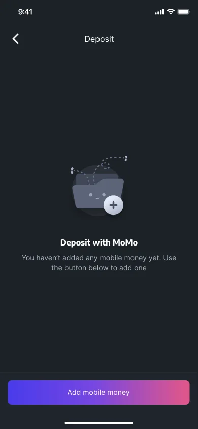
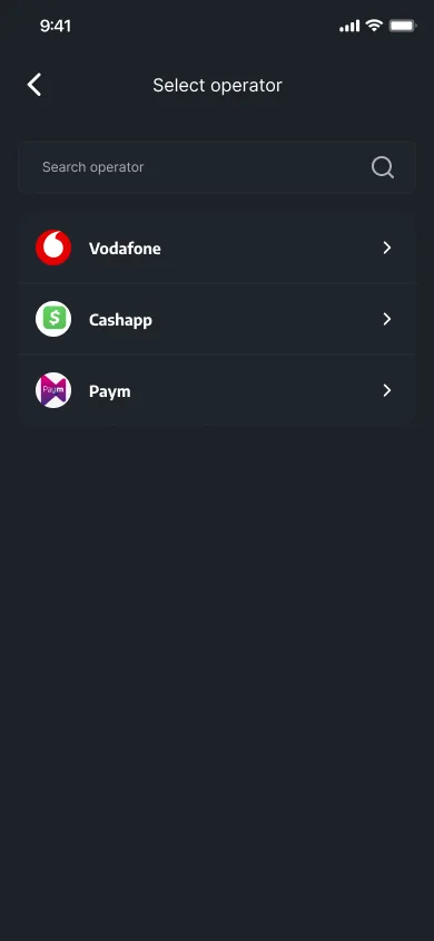
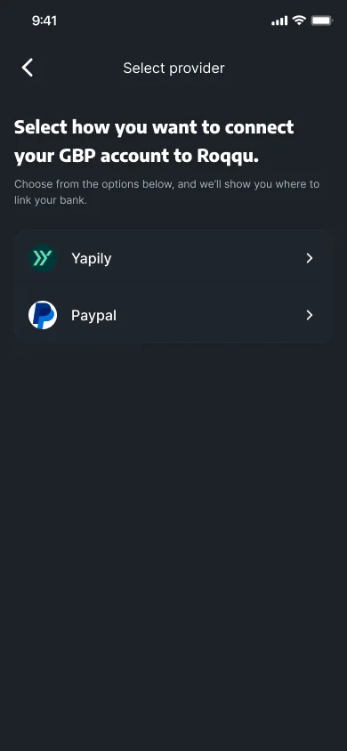
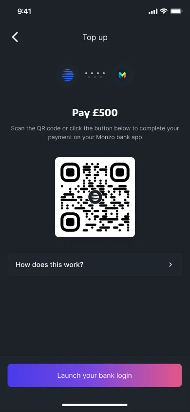
Deposits show it best: wallet and bank-app transfers for naira, mobile money across countries, and pay by bank for GBP accounts.
03 The problem
Complexity was costing trust.
Three things stood in the way of growth.
- New users struggled with onboarding.
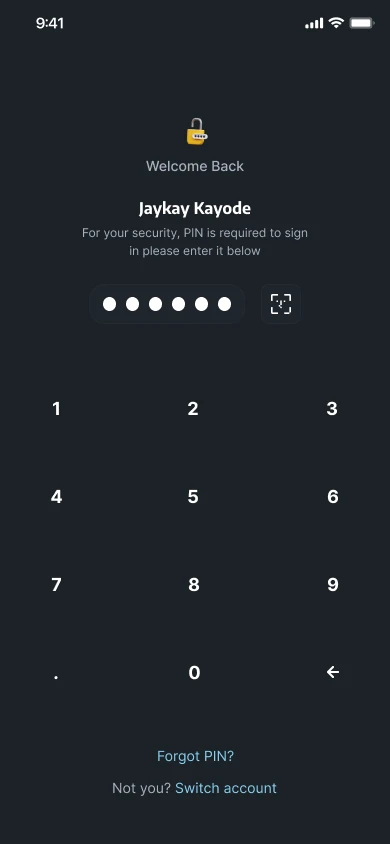
- Security wasn't strong enough, and it eroded trust. Support received dozens of reports from users who had fallen victim to scams.
- Navigation was unclear, so users found it hard to get around the app.
Rebuilding trust became the top priority.
As acting product manager, I aligned product, engineering, brand and business around one redesign that fixed all three problems.
04 How I worked
Listen first. Then build.
- 01
Teasing the expansion
Late 2022Before the big redesign, I revamped the website and aligned the UI across platforms, working with the branding team to bring in new assets.
- 02
Listening and learning
Early 2023I ran task tests on prototypes with 10 to 20 users across Africa and Europe to find where people dropped off. Three things came up again and again:
- A complicated KYC (identity verification) process.
- Limited educational resources.
- Missing tools to help people make informed decisions.
Most people who left did so during identity verification. And if they came back with their documents, they had to start again.
That made the first priority obvious: redesign KYC with step-by-step guidance, automated real-time verification and progress that saves between sessions.
What didn't work: KYC started as one long form, and people abandoned it. I split it into guided steps, so no one has to start again.
KYC /4Details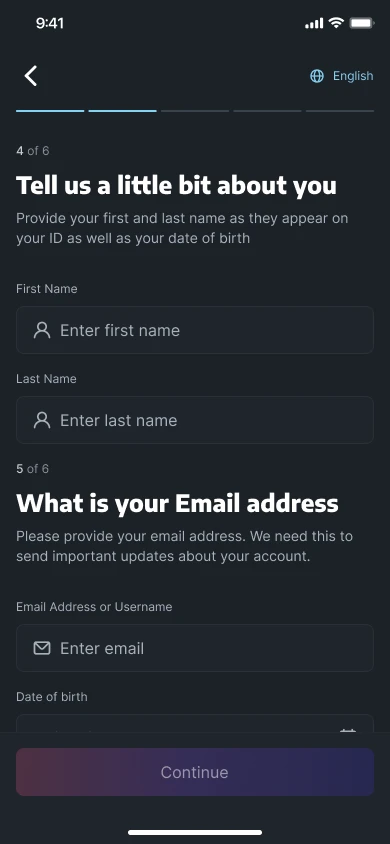
About youName and date of birth, as they appear on your ID. KYCPhone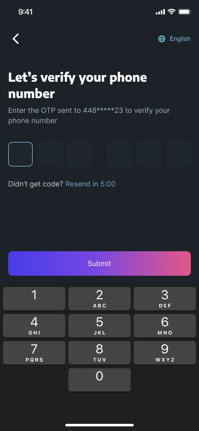
Verify your phoneA one-time code, with a clear resend timer. KYCAddress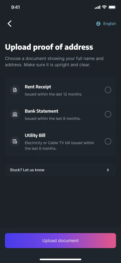
Proof of addressPick a document and see what counts before you upload. KYCPIN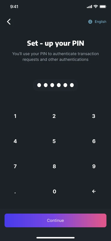
Set up your PINUsed later to authorise transactions. - 03
A minimal design system
FoundationsI built a basic system with core components, typography and a simple colour palette. The aim was consistency and scalability across every digital product, through reusable components.
- 04
Designing with precision
BuildDecisions were based on data, and I was embedded in the developers' sprints, with daily build reviews, to keep the designs functional and intuitive. I streamlined navigation and interactive elements, and added features that show people what is happening to their money:
- Clear transaction labels.
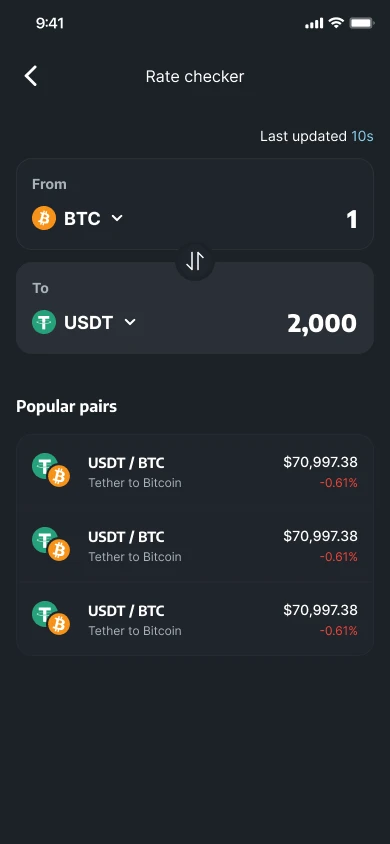
- A rate checker.
- A network checker.
- A transaction tracker.
Real-time information reduces risk, and reduced risk builds trust. To tackle security directly, I strengthened verification and added in-app education on spotting scams. Fewer fraud and account-takeover cases followed.
ToolNetwork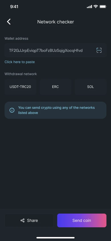
Network checkerCheck a wallet address and the networks it accepts. LearnQuiz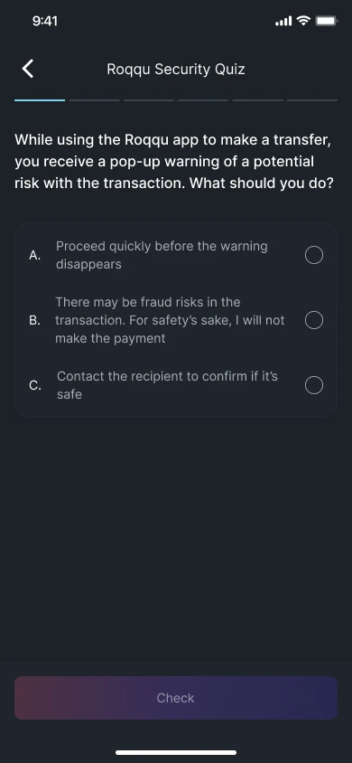
Security quizScam awareness, taught inside the app. LearnDone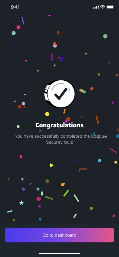
Quiz completeA small reward for finishing. ToolAnalytics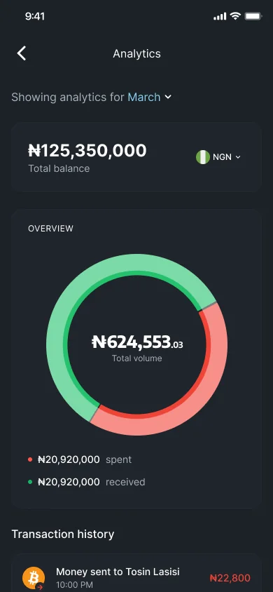
Analytics at a glanceSpent and received, with the total volume. - 05
Qash: fiat, finally findable
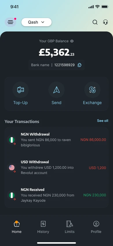
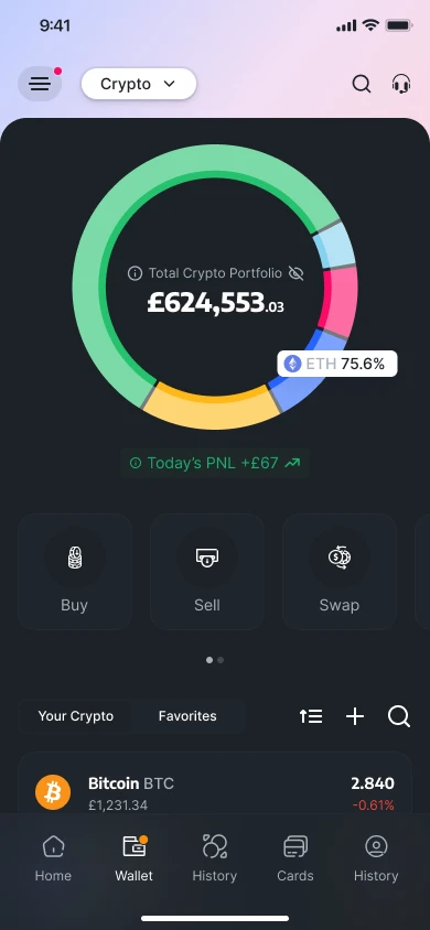
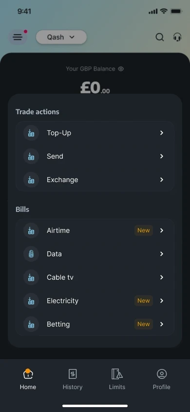
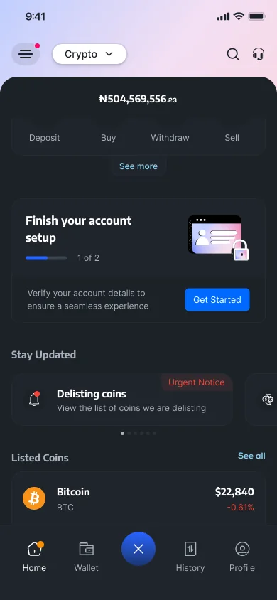
Information architectureFiat features were buried inside the crypto section. I introduced Qash and separated fiat and crypto into distinct sections on the homepage. Qash tools got their own area, and the crypto section focused on managing digital assets.
Qash lets people send, receive and swap, and buy data and airtime or pay bills, so they can take their crypto, convert it and spend it.
HomeCrypto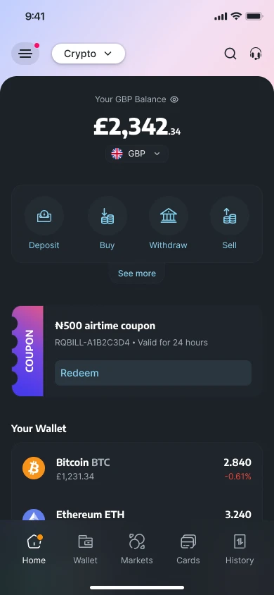
CryptoBalance, quick actions and your wallet. HomeCrypto menu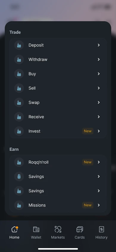
Trade and earnEvery crypto action, grouped. QashExchange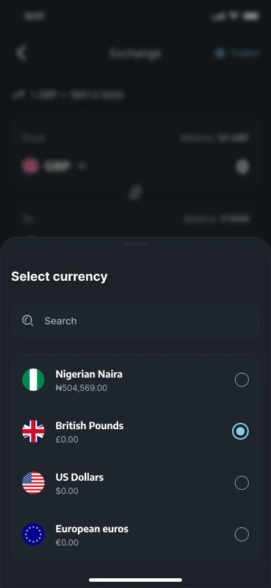
Pick a currencyNaira, pounds, dollars or euros, each with its balance. QashExchange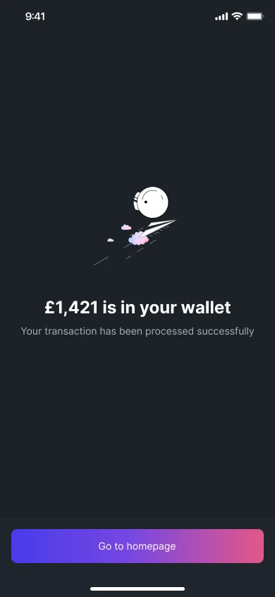
Money in your walletA clear confirmation once the exchange is done.
05 Validation
How I checked it worked.
- Usability tests on prototypes, before launch.
- TestFlight and staging builds with real users, before launch.
- Product analytics after launch.
06 Trade-offs
Three trade-offs that shaped it.
Every redesign is a set of trade-offs. These are the three that mattered most, and what each one cost.
- 01
A minimal design system, not a complete one
The constraintSix months, two regions and several products to ship.
What I choseI built the core first: reusable components, typography and a simple colour palette. It gave every product one consistent base, and it could grow as the product did.
What it costI gave up a fully documented library at launch. Some things had no component yet, and I chose to tidy those up later so the redesign could ship on time.
- 02
Simplify KYC without cutting it
The constraintRoqqu is regulated, so identity checks weren't optional, and they were also where users gave up.
What I rejectedA shorter KYC with fewer steps. Regulation ruled it out.
What I choseI kept every required check and changed how it feels: step-by-step guidance with automated, real-time verification, so people always knew where they were and what came next.
What it costReal-time verification depended on a third-party provider, so some parts of the flow were out of my hands. I put my effort into making every step I could control as clear as possible.
- 03
Show unfinished work early
The constraintTrust was low, and I didn't want to design in a vacuum.
What I choseI shared early versions through TestFlight and staging sites, and ran user surveys, so users could preview the changes and give feedback before the launch.
What it costEarly feedback created new requests that put the six-month deadline at risk, so I had to decide what to act on now and what to park. In return, I heard what was wrong while it was still cheap to change.
07 What shipped since
Four products, one decision each.
After the redesign launched, I kept designing the products that grew out of it. For each one: the decision I made, the guardrail I built in, and the result where I have one.
Qash
Decision
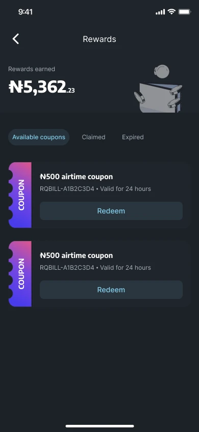
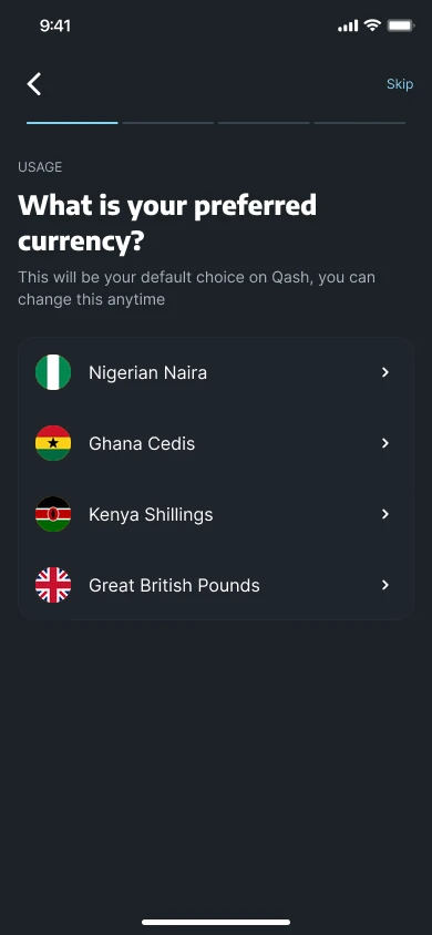
Make Qash a full money app, not just a way to send money: one menu for top-up, send, exchange and bills, plus rewards and a default currency (Naira, Cedis, Kenya Shillings or Pounds).
Guardrail
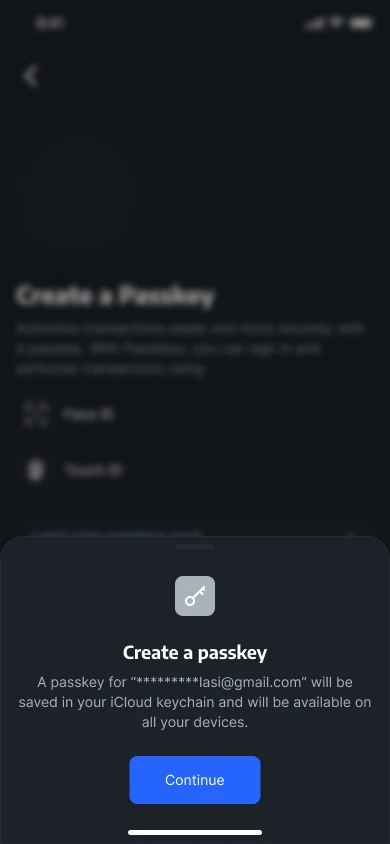
Security people control: a spending limit they set themselves, approval by authenticator app, WhatsApp or a one-time code, and passkeys.
Result
60% higher Qash adoption in the first six months after the 2023 launch (see the metrics note above).
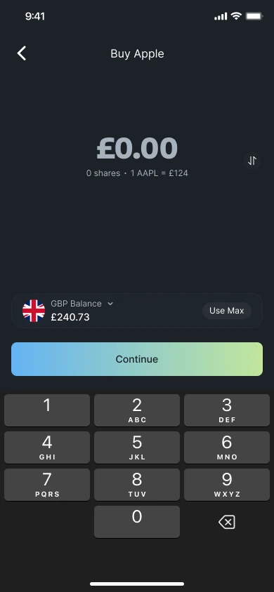
Stocks
Decision
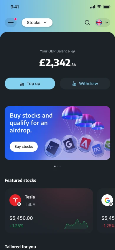
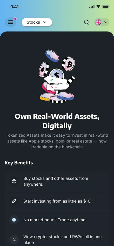
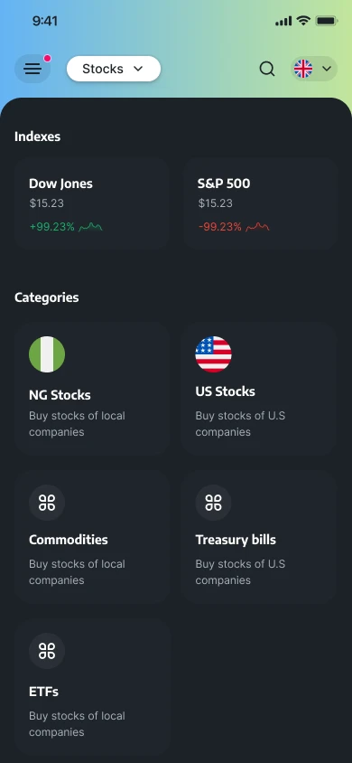
Start with an explanation, not a ticker: an intro on tokenised assets and fractions, then browse by familiar groups such as Nigerian and US stocks, commodities and ETFs.
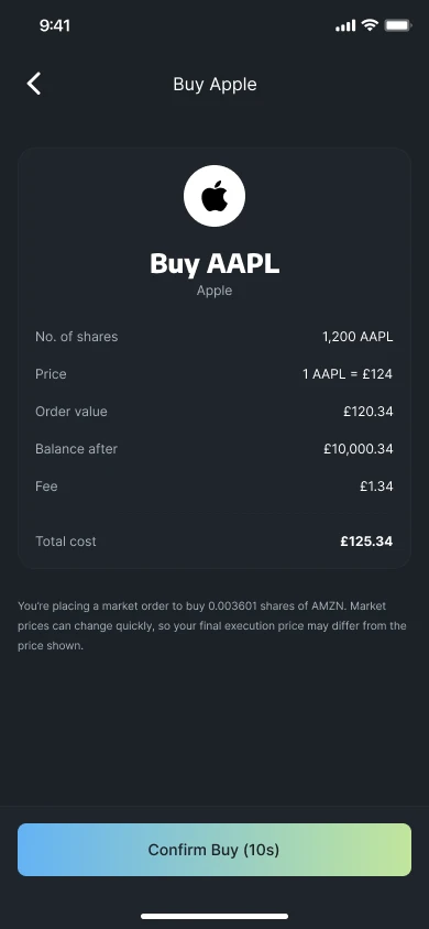
Guardrail
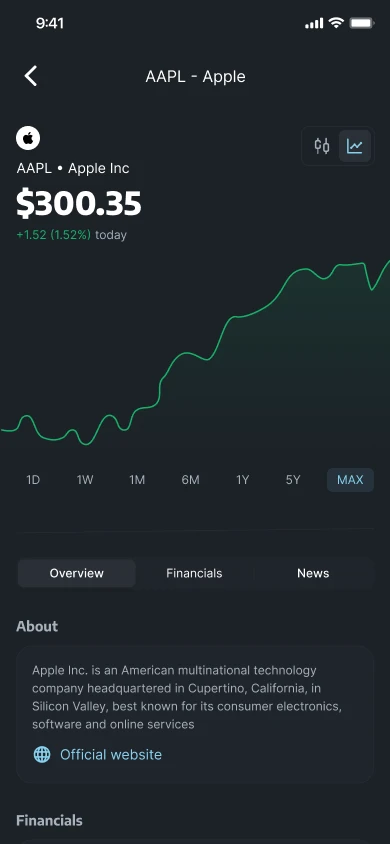
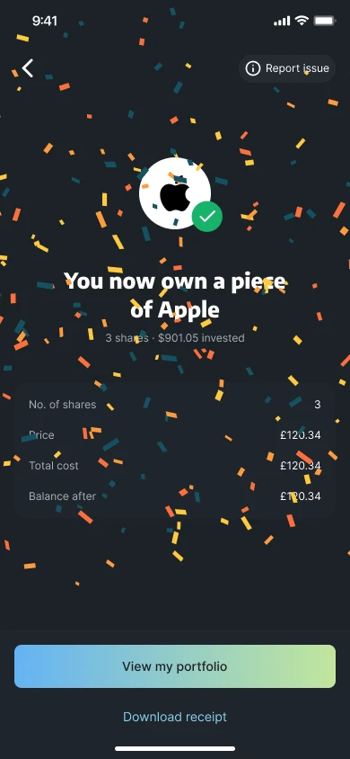
Every cost on the table: shares, price, fee and total, plus a plain note that a market order can fill at a different price.
Result
17 tokenised stocks available to trade on Roqqu.
Contracts
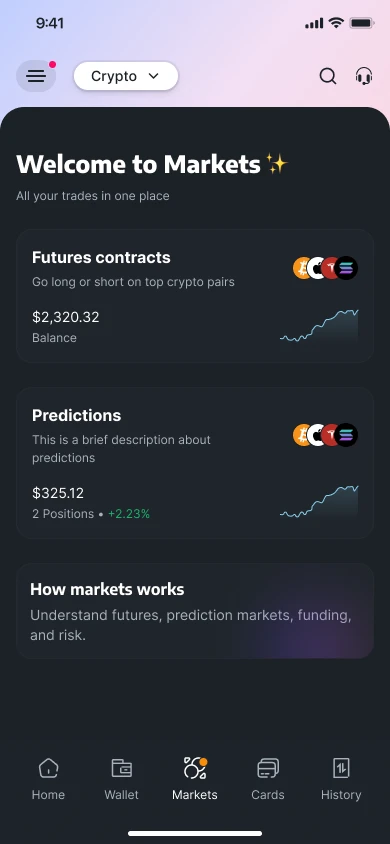
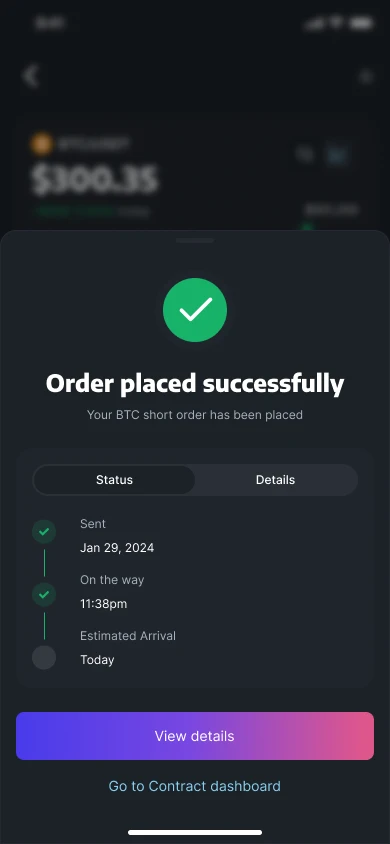
Decision
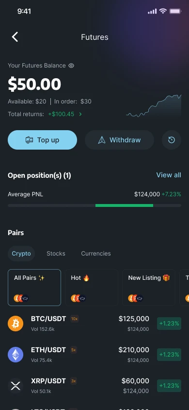
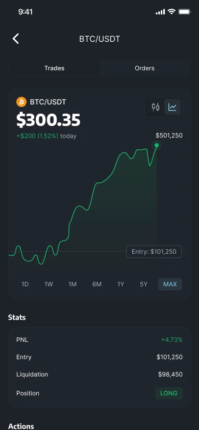
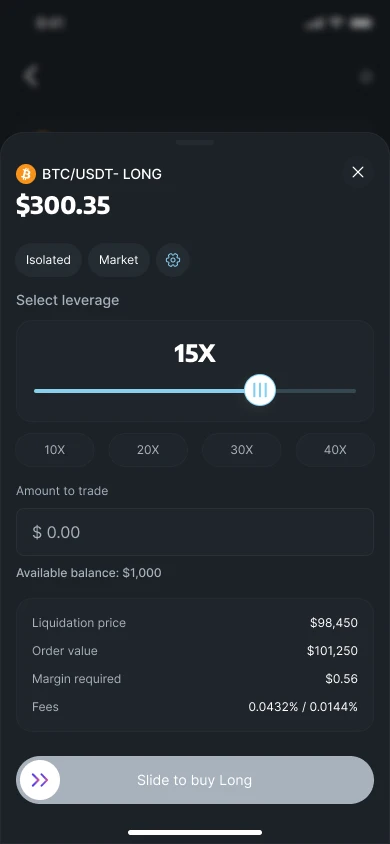
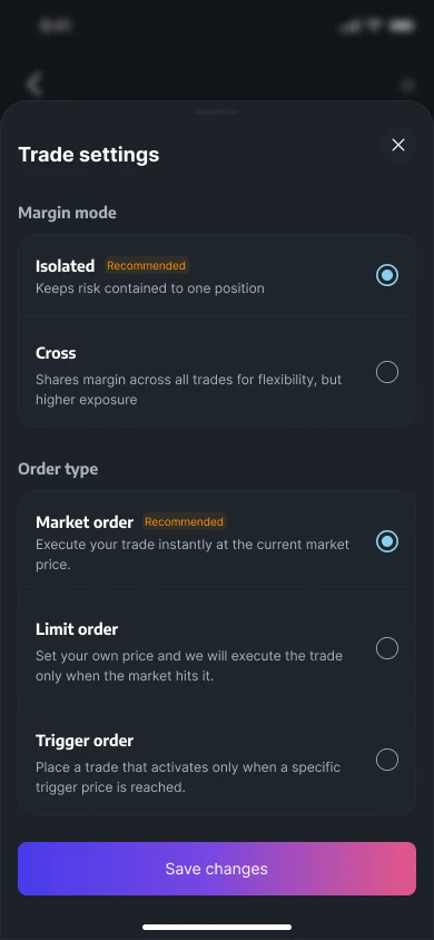
Put futures in a Markets tab of their own, with a short guide to how futures, funding and risk work.
Guardrail
Safer defaults and slower moments: isolated margin is recommended, each order type is explained, leverage is set on a slider and the order is placed with a slide to confirm.
Result
In the first 100 days: ₦12B+ in volume processed, 33K+ traders onboarded and 25K+ futures orders completed. Roqqu's own figures, from the whole team.
Read the full Contracts case study →
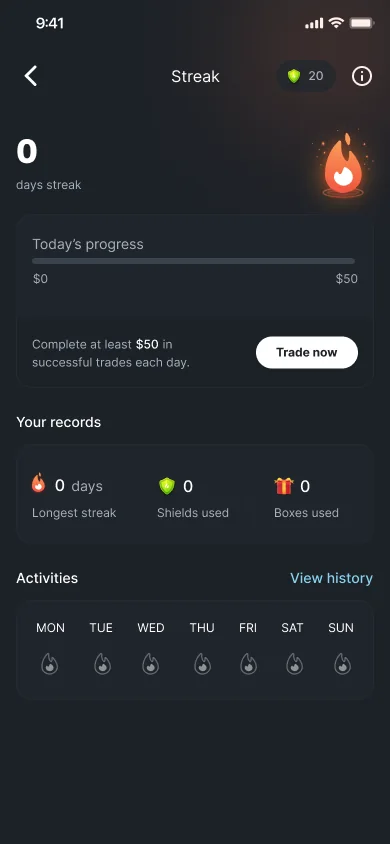
Trading streak
Decision
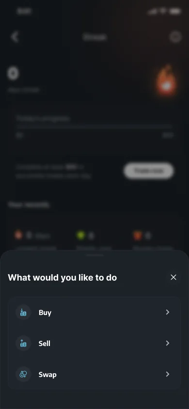
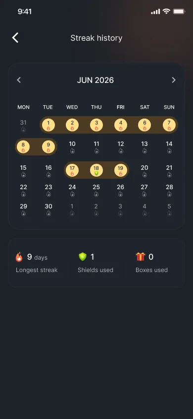
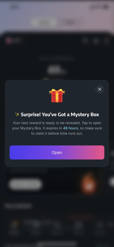
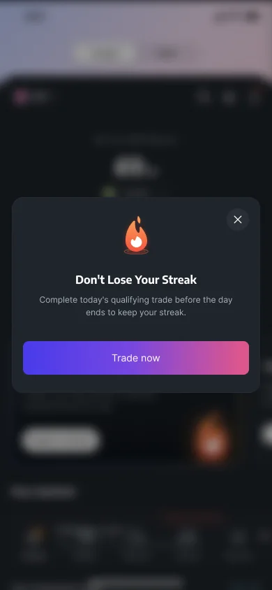
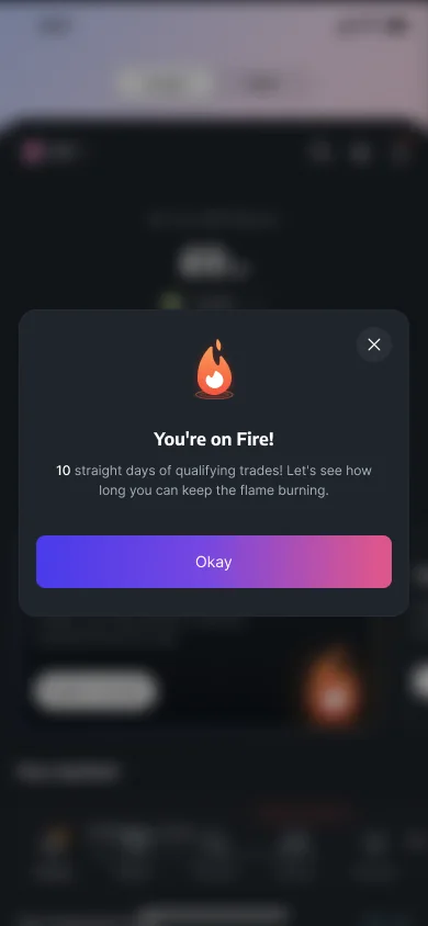
Turn trading into a daily habit: complete at least $50 in trades each day to build a streak, with milestones, a mystery box reward and a calendar of past days.
Guardrail
A Protection Shield that automatically saves your streak if you miss a qualifying day, and a nudge to trade before the day ends.
08 Leading the team
Clear ownership, a team that shipped.
I led four designers and an illustrator, and stayed hands-on.
What I designed myself
- The app's information architecture and homepage layout
- Onboarding and the KYC redesign
- The design system foundations
- Qash, the fiat area
How I led
Ownership
Split by platform. Designers owned theirs end to end.
Hands-on
Designed and shipped alongside the team, inside the developers' sprints.
Open feedback
Regular, clear feedback. Unfinished work shared early.
Rituals
- Design reviews
- Weekly 1:1s
- Daily build reviews with developers
- Design system upkeep
Beyond the design team
Roadmap
Led planning as acting product manager.
Principles
Set shared design principles other teams could use.
Mentoring
Coached designers and teammates.
09 Showcase
The website, and the video.
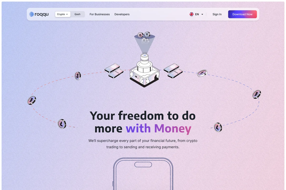
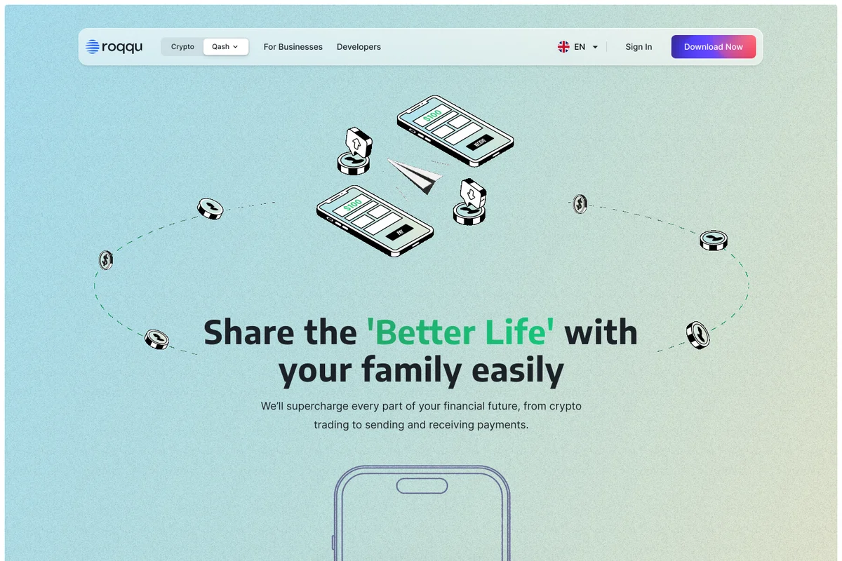
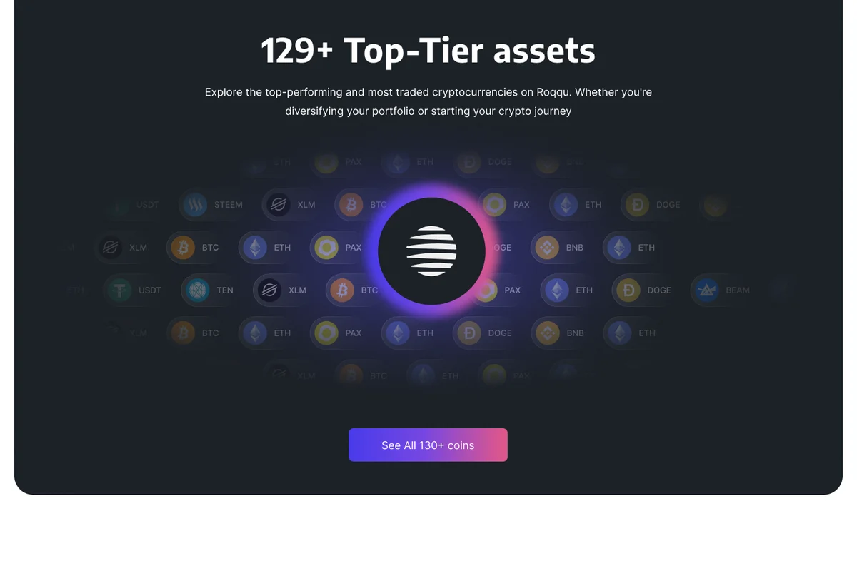
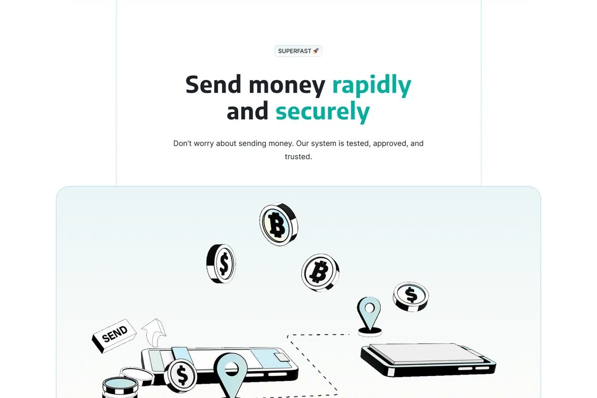
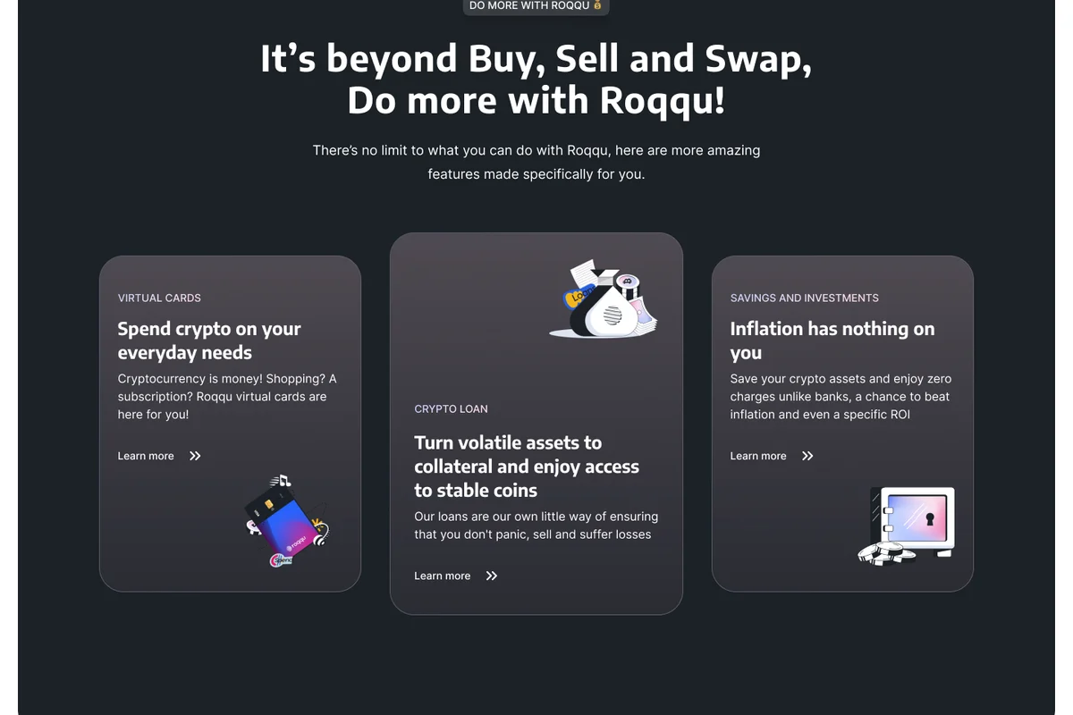
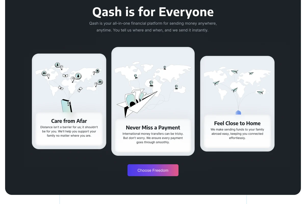
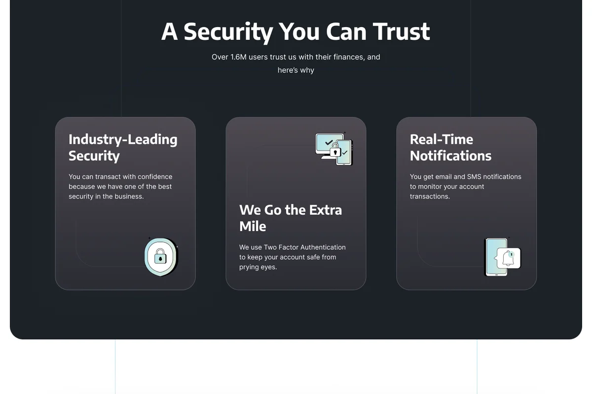
The marketing website and video that sit on top of the product, in the same design language. Swipe through the pages.
The marketing video
Kayode brought clarity to a complicated product. He made the hard calls with us, and the team always knew what to build next.
10 Reflection
And it keeps going.
I've stayed on as lead product designer since, redesigning the homepage, adding gamified features and simplifying investing. The aim of each was to bring more people in and keep them coming back.
The hardest parts were designing for people with very different needs across regions, and keeping pace with a market that never stops moving.
What I'm proudest of: getting product, engineering, brand and business behind one redesign, across two regions, inside six months.
What I'd do differently: test with more users, earlier. We tested with 10 to 20 people, and I'd bring in more people sooner so problems surfaced even earlier.