Case study Pugpig · 2023
Customisation without developers.
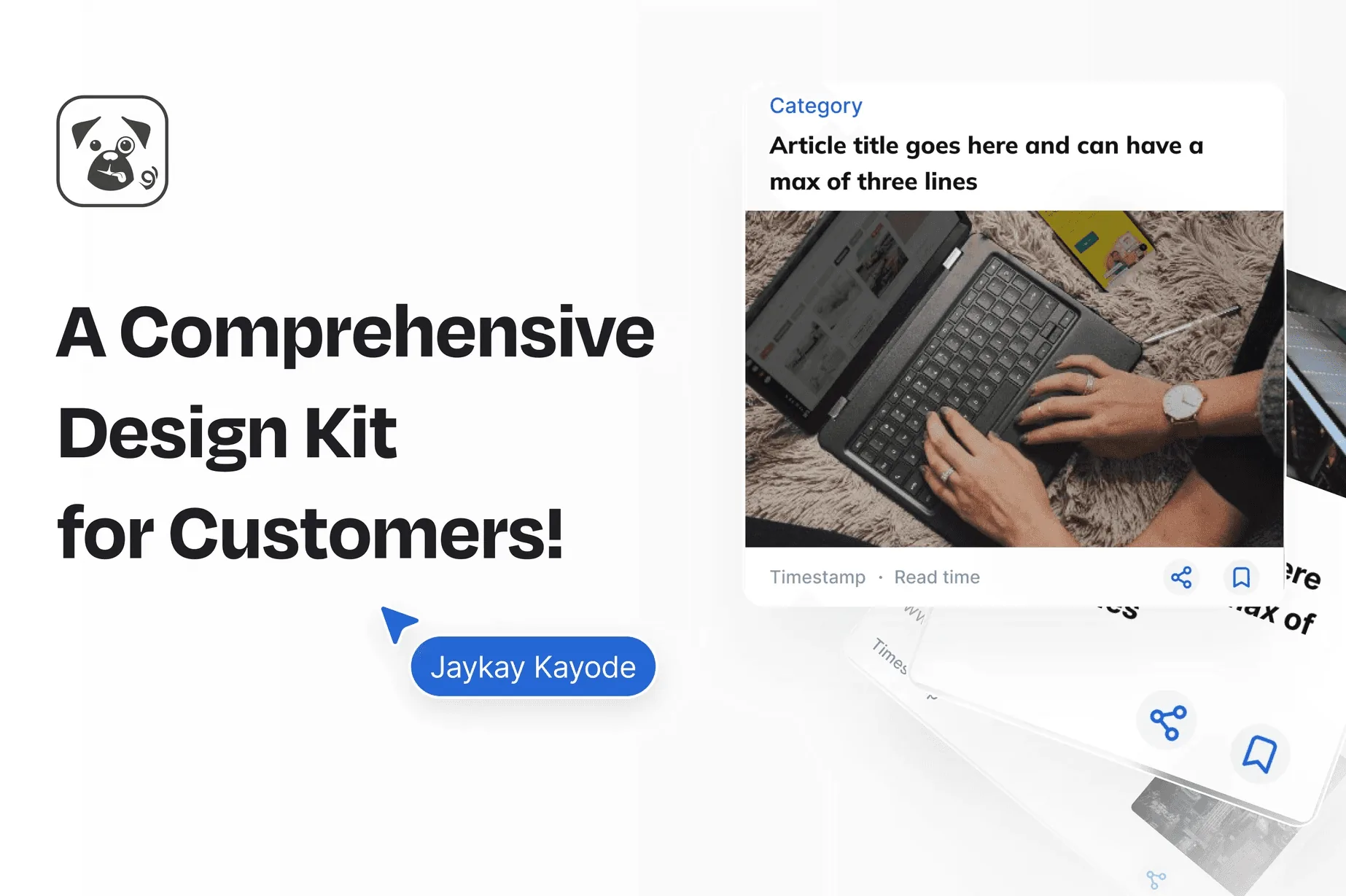
Pugpig powers apps for media brands, and every brand wants its app to look and work its own way. I was the sole designer and led the Pugpig Design Kit: a modular system that lets publishers customise quickly and stay consistent.
- The problemCustomising a Pugpig app meant waiting on developers, and the guidance to do it yourself was thin.
- What I didLed design of the Design Kit: a Figma component library, theming controls, layouts and the documentation.
- The resultHigher customer satisfaction, more use of the documentation and more new customers after launch.
Sources: a customer survey, Help Juice analytics and sales data. These are company results, from product, engineering and sales as well as design.
01 Context
Every brand wanted its own app.
Pugpig powers apps and websites for many media brands. Each has its own identity and audience, and clients wanted more control over how their app looks and behaves, without losing usability, consistency or performance.
I came to Pugpig from fintech, where the work was precision and trust. Publishing asked for something different: flexibility, with guard rails.
02 The problem
Customising meant waiting on developers.
Three things stood in the way.
- It depended on engineering. Changing how an app looked took developer time.
- It was complex. The process was hard for non-technical content teams.
- Guidance was thin. Clients wanted fuller guides and tutorials.
From interviews and workshops, so directional rather than statistical.
03 Goals
Less waiting, more ownership.
- Reduce dependence on developers when clients customise their apps.
- Improve time to launch for branded apps.
- Increase adoption of the customisation tools.
I measured success through customer satisfaction, use of the documentation and new customer acquisition.
04 Research
Listening to the people who run the apps.
I used three methods to understand what clients needed.
- Workshops and interviews with content teams, designers and developers.
- Customisation audits of how brands had changed their Pugpig apps.
- Competitive analysis of other CMS-driven platforms.
Most of the insight came from the audits and the stakeholder conversations. Clients wanted customisation at three levels.
Branding and theming
Colours, fonts and logos.
Layout and components
Flexible arrangement inside structured grids.
Feature modularity
Switching features on and off.
05 Design decisions
Four calls that shaped the kit.
Each one is a trade between freedom and safety, and each has a cost.
- 01
Freedom inside guard rails
The constraintBrands wanted control, but every change risks usability and performance.
What I choseThree levels of customisation, branding, layout and features, inside structured grids and responsive limits.
What it costLess free-form layout, in return for apps that stay usable and fast.
- 02
Smart defaults, not a blank canvas
The constraintNon-technical editors should not need design skill to launch something good.
What I choseBest-practice defaults, editable preset templates and feature toggles that do not break the experience.
What it costDefaults can feel opinionated, so every one stays editable within limits.
- 03
Build where the team already works
The constraintA new tool would add a learning curve for clients and for the team.
What I choseA Figma component library, because the team already knew Figma.
What it costThe kit started as a design-side system first, with tokens and APIs for developers alongside.
- 04
Treat documentation as part of the product
The constraintCustomisation without guidance just moves the problem to support.
What I choseStep-by-step guides written in Help Juice, alongside the components.
What it costMore to write, and more to keep current.
06 The Design Kit
One system, four pillars.
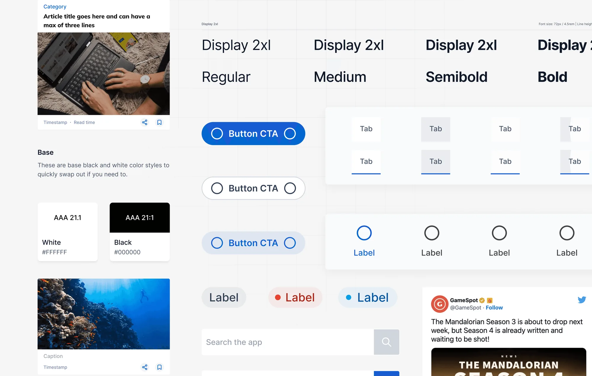
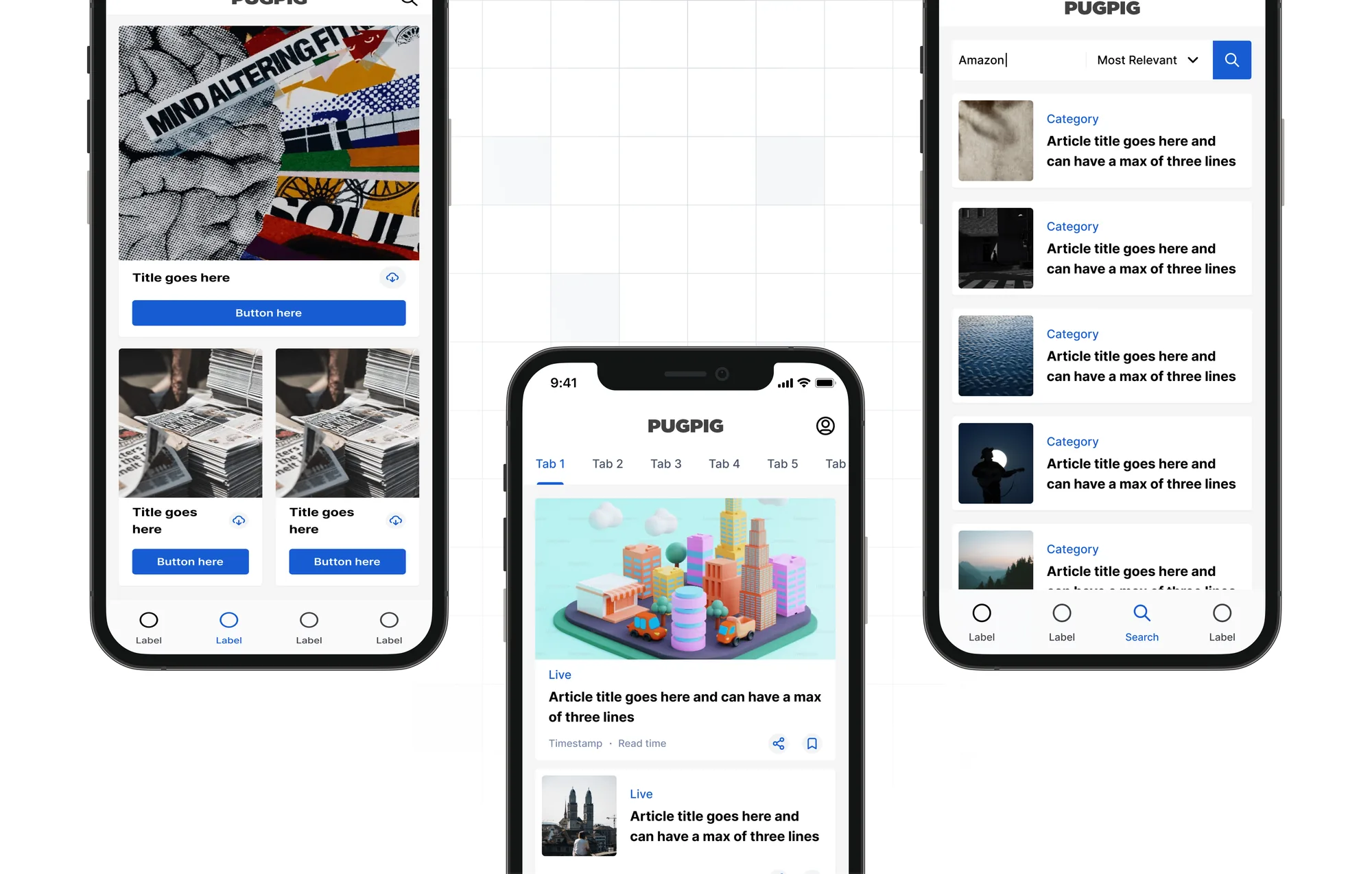
Modular UI components
Reusable article layouts, flexible navigation and dynamic content blocks for multimedia.
Branding and theme controls
Brand colours, typography, button styles and spacing, set inside a structured framework.
Smart defaults
Best-practice defaults, editable presets, adjustable spacing and type within responsive limits.
Built for everyone
A UI designers and content teams can use without code, with structured tokens and APIs for developers.
07 How we worked
Product, engineering and customers, in sprints.
- Product aligned the kit with user needs and market trends.
- Engineering built the technical customisation framework.
- Customer success brought client feedback as we went.
We worked in agile sprints, with weekly design critiques and sprint demos.
08 Outcome
Faster to launch, easier to own.
Content teams could change how their app looked and which features it had without waiting on engineering, and developers could focus on harder problems. By my estimate, customising an app went from weeks to days.
Customer satisfaction
Increase, from a customer survey.
Documentation visits
Increase, from Help Juice analytics.
New customers
Increase, from sales data.
Acquisition rose alongside other work, so I treat it as a sign, not proof, that easier customisation helped.
09 What I learned
What I took from it.
- Freedom inside guard rails works better than freedom or restriction alone.
- Documentation is part of a design system. A kit nobody can learn does not get used.
- Measure from the start. I would track how long customisation takes before and after, instead of estimating it.