Case study Moniepoint · Flexible Savings
Flexible Savings, rebuilt around trust.
Flexible Savings is Moniepoint’s most liquid savings product. I led design on its end-to-end revamp, fixing the trust gaps that held back first deposits and repeat use.
- The problemA liquidity product that felt punitive, with projections that ignored the user’s own plan.
- What I didRebuilt the projection, reframed withdrawals as an interest trade-off, and gave the dashboard a banner that knows where each user is.
- The resultPlan-creation errors fell by a third, and more plans are created in under two minutes.
Source: Mixpanel
01 Context
The most liquid product in the suite, and the one that had drifted.
Each savings product had drifted its own way. Target Savings set one design language for the suite, and its results made the case for Flexible Savings to follow.
02 The problems
Four places the old experience broke its own promise.
I found these in withdrawal-related support tickets, and each one is a place where what the screen promised and what happened did not match.
- 01
Projection mismatch
What users sawMonthly figures, whatever cadence they picked.
Why it matteredDaily and weekly savers saw numbers that were not theirs.
- 02
A counter with no context
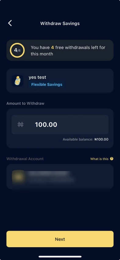
What users saw“You have 4 free withdrawals left”, and no word on what the 5th would cost.
Why it matteredA liquidity product felt punitive: “will I get my money back?”
- 03
One-size dashboard
What users sawThe same nudge for every user.
Why it matteredNon-savers, churned and active savers need different prompts.
- 04
Visual drift
What users sawCard styles and tone that differed from Target Savings.
Why it matteredAn inconsistent experience between savings products.
03 Goals
Make it consistent, then make it work better.
Consistency
Adapt the shared system to Flexible’s mechanic: full access, with a monthly interest trade-off.
Reliability
More people finishing a plan, quickly and without errors.
- Plan-creation errors, the reliability signal.
- Time to create a plan, the effort signal.
- Top-up and withdrawal completion, to check the framing reassures.
04 Design decisions
Four decisions that carried the revamp.
Drag each phone to compare the live screens with the redesign.
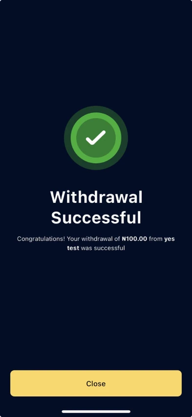
- 01
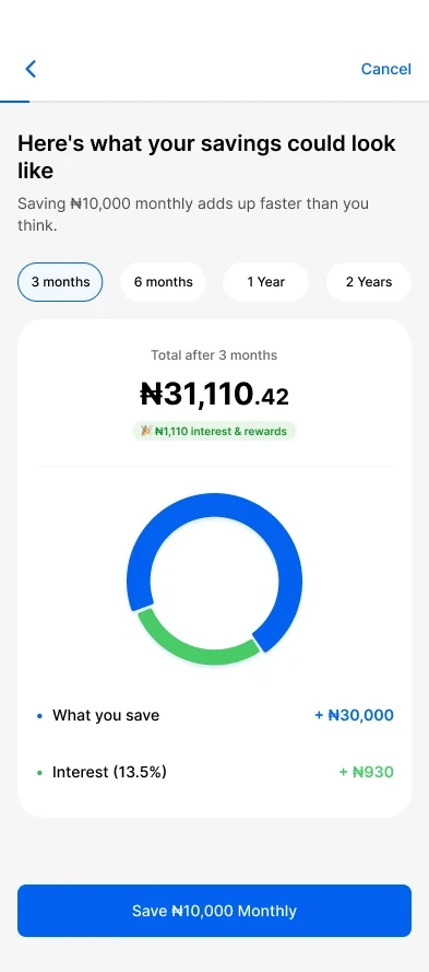
An adaptive projection screen
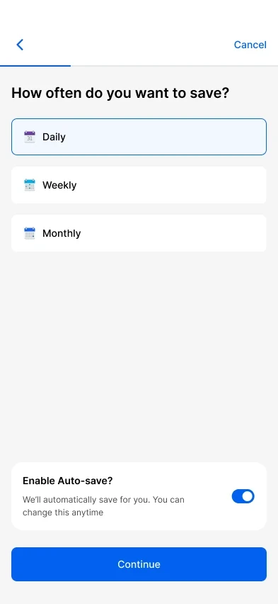
Copy, amounts and call to action now follow the cadence the user picks. A daily saver sees “Saving ₦500 daily adds up faster than you think”, with totals that match.
Step /1FrequencyHow oftenThe user picks a cadence and turns on auto-save. Step /2Schedule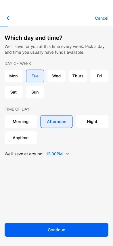
WhenDay and time, so the save lands when funds are there. Step /3ProjectionWhat it adds up toTotals, interest and the period chips, tied to the plan. - 02
Withdrawal reframed from restriction to trade-off
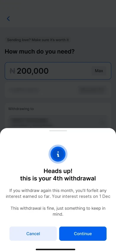
The four-withdrawal rule is a consequence, not a block. Full access stays; only that month’s interest is at stake. I rewrote three moments around that.
- Warning. A soft nudge on the 4th, a clearer one on the 5th.
- Counter. Interest-safe withdrawals left, before, on and after the 4th.
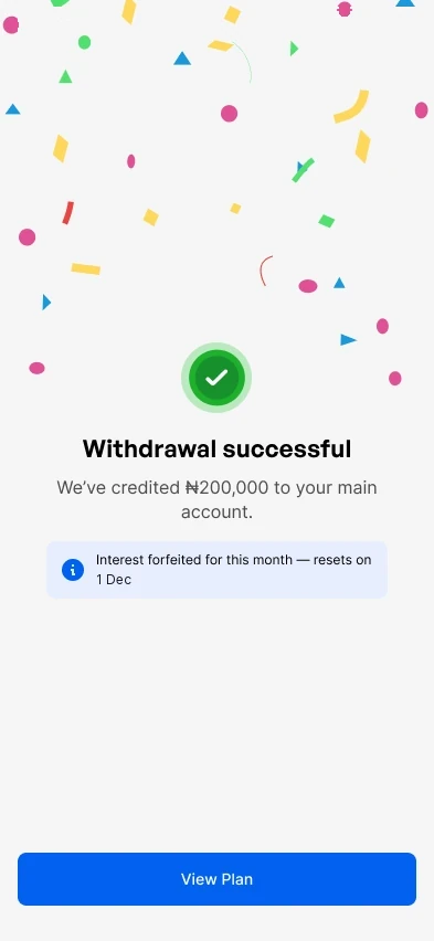
- After forfeit. Balance intact, interest resets next month.
Copy rule: never “blocked”, “restricted” or “locked”. “Forfeit”, not “lose” or “penalty”.
Withdraw /4WarningHeads up on the 4thA trade-off, not a block. Withdraw /1-3Success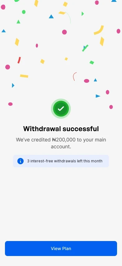
Withdrawals 1 to 3The counter shows what is left. Withdraw /4Success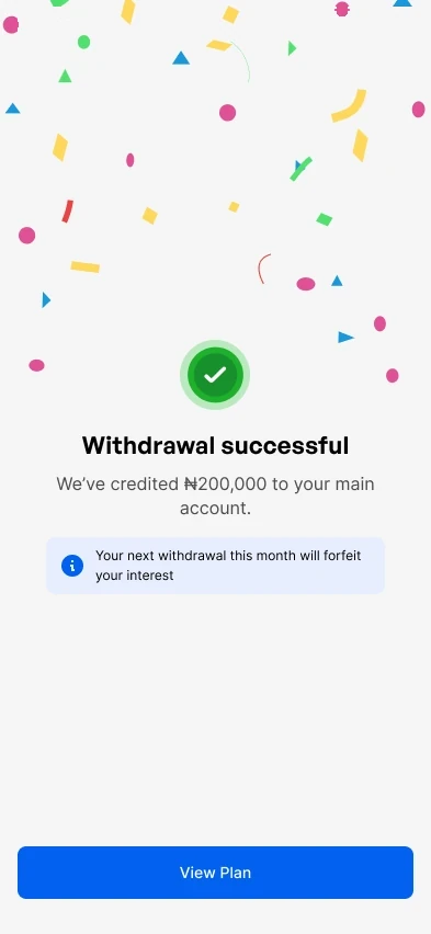
On the 4thThe next one will cost the month’s interest. Withdraw /5ForfeitedAfter the 4thBalance intact, interest resets. - 03
A dashboard banner that knows where the user is
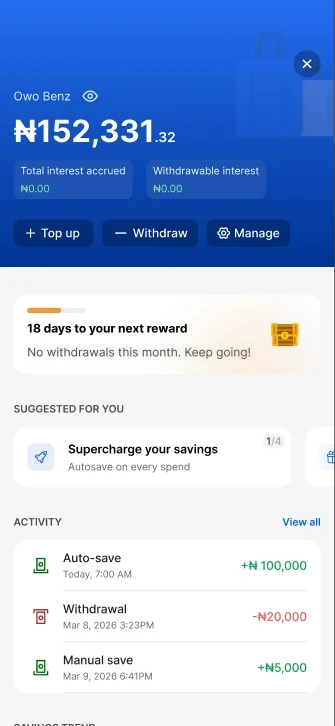
One banner, three user states, each with its own rules for when it appears, hides and retires. It keeps nudging without nagging.
Banner /1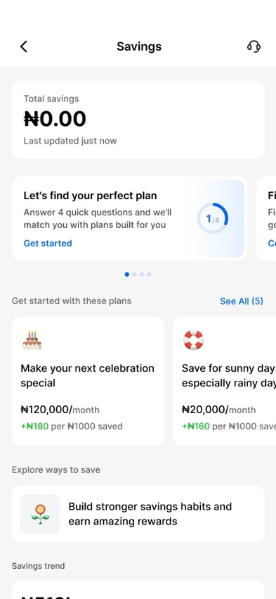
Never startedA four-question quiz that matches a plan to the user’s goals. Banner /2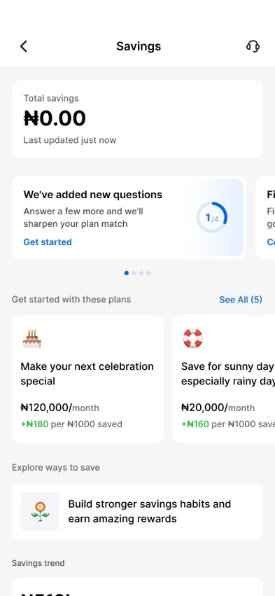
Something new to answerNew KYC questions get their own prompt on the day they go live. Banner /3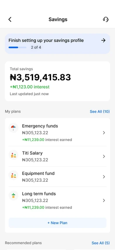
Part-way throughProgress shows how little is left, pinned above the balance. Ignore it and it hides for 2–3 days, returns up to 3–5 times, then retires for good.
- 04
Full-flow coverage
Plan management, activity, sharing and error states, all on the shared system.
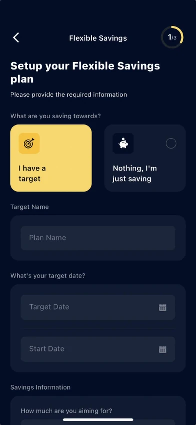
- Tap FlexibleFrom the savings dashboard.
- Config checkThe app checks the plan is available.Fails: “something unexpected occurred”, with Try again or Back
- Intro to the productNew user: slideshowReturning: single page
- Interest preferenceWith interest or without.
- CategoryOr add a custom category
- FrequencyDaily, weekly or monthly.
- AmountInvalid: “Please choose a valid amount”
- Funding source
- Date and timeWhen the save lands.
- Plan name
- Summary and termsReview, edit, accept.API error: “unable to process your request”
- Success, then the planView my plan opens the plan dashboard.
- Plan dashboardThe hub for one plan.
- Plan name
- Total saved and interest earned
- Top up
- ActivityLoads the full historyError 500: “unable to load data”
- FAQsPlan questionsError 500: “unable to load data”
- Manage planUpdate plan scheduleUpdate plan details
- Plan dashboard
- User selects Withdraw
flexible_savings_withdrawal_initiated - How much do you want to withdraw?
- Enters an amount
flexible_savings_withdraw_amount_entered - Why do you want to withdraw this money?A reason card, not a form.
flexible_savings_withdraw_reason - Partial withdrawal decision
flexible_savings_partial_withdraw_decision - Success
flexible_savings_withdraw_success - ErrorError 500: “unable to process your request, please try again”
flexible_savings_withdraw_error
Every step in the create and withdraw flows carries a named analytics event with defined attributes, so the funnel is measurable from launch.
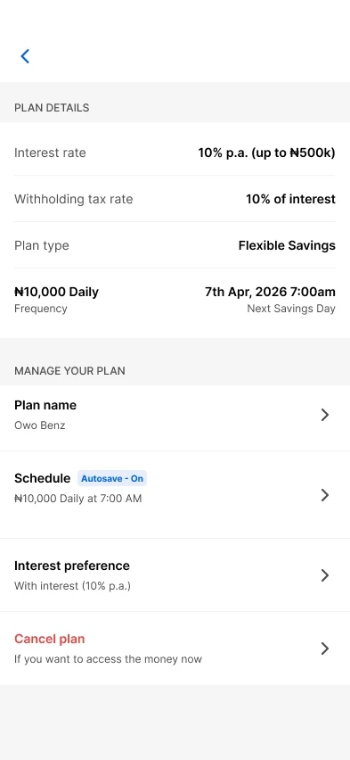
Opens a viewer you can zoom and pan.Plan /1ManageManage the planEvery setting in one list, cancel last. Plan /2Top-up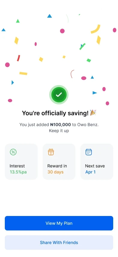
A first deposit that confirmsRate, reward date, next save: what savers want to know. Plan /3Pending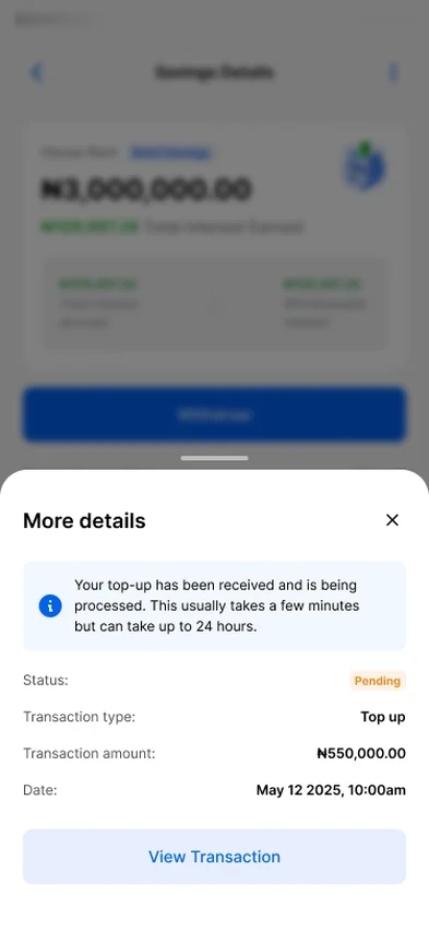
Honest about pendingA pending top-up says so plainly, with the amount, status and date.
05 Trade-offs and constraints
The calls that weren’t obvious.
- 01
Warn on the 4th, not just the 5th
The constraintEvery extra screen adds friction, and the rule only bites on the 5th.
What I choseA nudge on the 4th, a warning on the 5th with “Withdraw anyway”.
WhyOne more screen, but people choose before the limit, so the 5th is no surprise.
- 02
Totals that follow the cadence
The constraintStatic period chips meant daily and weekly totals did not match the plan.
What I choseI flagged it to the PM and drove the call to recalculate totals by frequency.
WhyA projection that ignores cadence breaks trust before the first deposit.
- 03
Asking why people withdraw, without a form
The constraintWe wanted the reason, but a form adds friction at the worst moment.
What I choseA conversational reason card.
WhyIt captures the reason without making users justify themselves.
06 Validation
We tested trust, not just usability.
Tobi, the Liquidity-First Operator
Needs cash at short notice. Does the trade-off framing make full access feel real?
Ebenezer, the Hustle Reinvestor
Reinvests often. Do the counter and warnings feel fair, not punitive?
Two behavioural personas from Moniepoint’s 2025 discovery research. I wrote the screener, a moderated script and unmoderated Useberry tasks, with Nigerian-specific amounts so scenarios felt real.
07 Delivery and QA
The build matched the designs, and we could prove it.
- Prototype-first handoff. Interactive prototypes showed real cadence and withdrawal states.
- Joint QA. Design QA rounds with engineering and the PM before release.
- Proof under pressure. A stakeholder flagged possible discrepancies at the showcase. A screen share showed the app matched the designs; it was a local bug on his device.
- Cross-surface. The trade-off principle carried into the Savings Ranking System and the Customer Savings Report.
08 Outcome
One design language, and clear terms.
Flexible Savings now shares one design language with Target Savings and is clear about the deal: full access, with interest as the only trade-off.
Plan-creation errors
Error rate when creating a plan, a third lower.
Plans created in two minutes
Share of creation sessions finishing within two minutes.
Manage-plan errors
Error rate when managing a plan, over a third lower.
Top-ups completed
Of people who start a top-up, the share who complete it.
Source: Mixpanel
09 What I learned
Four things I’ll carry forward.
- Frame the rule by its consequence. Same rule, punitive or fair, depending on the copy.
- Match numbers to the user’s plan. Ignoring cadence breaks trust before the first deposit.
- Separate leading and lagging metrics. Errors and speed show the experience; retention follows.
- Review before handoff. Tight QA let us answer the discrepancy question in minutes.
10 What I’d do next
A few months shows the flows work. Habit takes longer.
A few months of data shows the flows work. The harder question is whether people keep saving.
- Repeat deposits by cadence, for daily, weekly and monthly savers.
- Retention by banner state, to see which nudge brings people back.
- After the 5th withdrawal, do people return next month?