Case study EN1 Technologies · 2023 to 2024
The software around an electric car.
EN1 is building an electric vehicle brand in Nigeria. As design manager, I led design for everything a buyer, a driver and an operator touches: the website and configurator, the mobile app and Kit Shop, the in-car infotainment, the admin portal and the factory ERP.
- The problemA new EV brand with no digital presence, and software to design for three very different people.
- What I didLed a design team and one design system across six surfaces, from configurator to car screen to procurement.
- The resultAbout 300 people joined the waitlist in the first month. The car screen is a clickable prototype, not yet tested in a vehicle.
01 Context
A new EV brand, and software for every touchpoint.
EN1 Technologies wants to be a leading electric vehicle name in Nigeria, as petrol gets dearer and buyers look for a luxury alternative. A car is only part of the product. The brand also needed a place to explore it, a screen inside it, an app to own it and tools to build and sell it.
“To address this issue, the team at EN1 is building a production-level car that does not require a charge from an electrical power outlet for months, thereby eliminating the need for stable electricity in every country the company ships its cars into.”
Research with Nigerian buyers showed they wanted easy exploration, content that feels relevant and a smooth mobile experience. One question ran through every surface: how do we show luxury without hurting usability?
02 The design
Six surfaces, built as one system.
- 01
The showroom: website and configurator
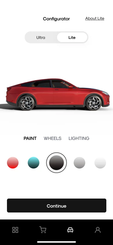
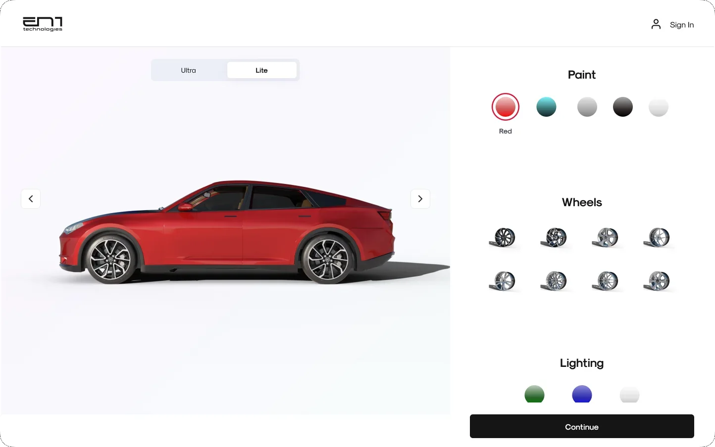
The website presents two models, the Ultra and the Ultra Lite, with full-bleed imagery and a clear next step. The configurator lets people choose paint, wheels and lighting, watch the car update, then review their build and join the waitlist.
WebsiteHomepageThe website, on desktop and mobile. ShowroomConfiguratorThe configurator: paint, wheels and lighting. ConfiguratorReview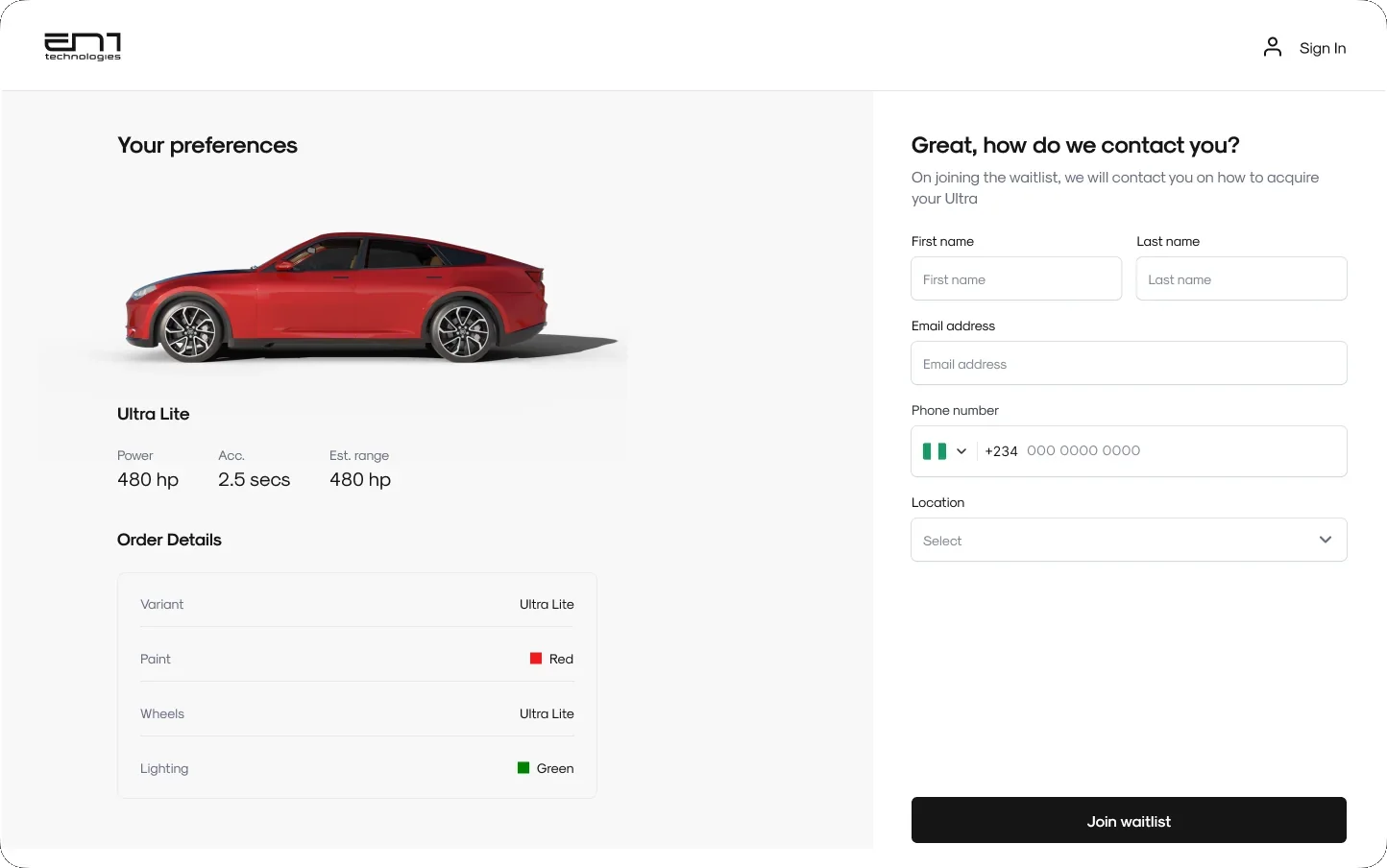
Review the build, then join the waitlist. - 02
The car: in-car infotainment
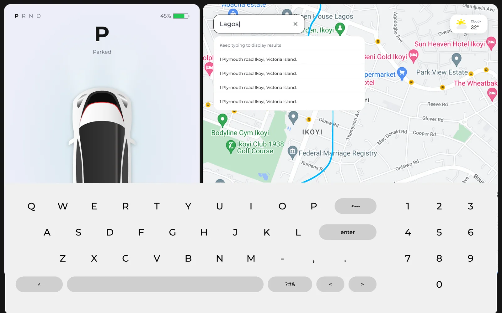
A landscape screen split into a driver panel and a full-height map. It is a clickable prototype for the vehicle display, not yet in a car. The project is ongoing, and I left before it was tested in a vehicle. Three rules shaped it:
- Glanceable driving. Gear and battery sit up top, speed is the largest thing on the panel, and the car view moves from parked to a lane view.
- Controls that never move. Climate, seat, fan, defrost and volume live on one fixed bar, so nothing needs a menu.
- The map stays. Apps open as a tray over the map, so navigation never disappears.
LayoutScreen zones1 Driver panel. Gear and battery up top, speed in the largest type, and the car view. 2 Map. Full height, so navigation stays visible; apps open over it as a tray. 3 Fixed bar. Climate, seat, fan, defrost and volume, always in the same place. InfotainmentIn motion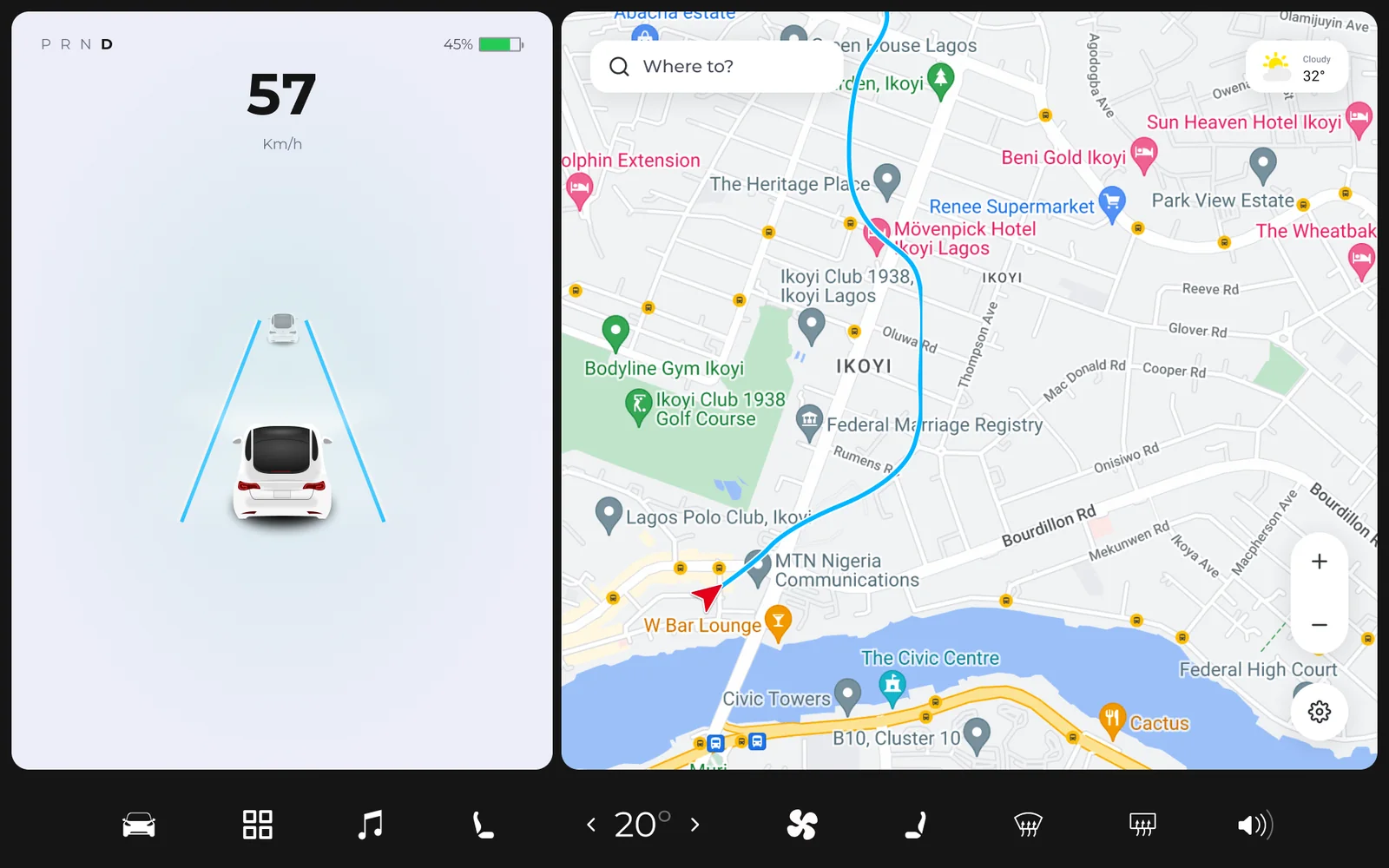
In motion: speed in large type and a lane view, with the route on the map. InfotainmentApps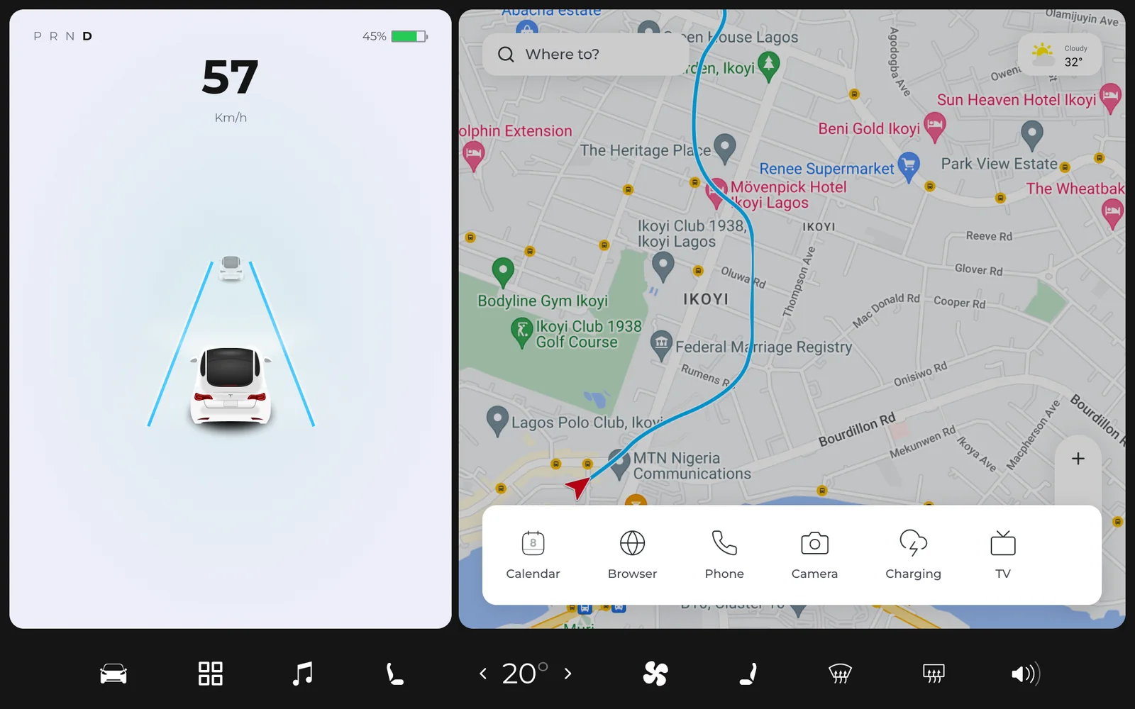
Apps open over the map: Calendar, Browser, Phone, Camera, Charging and TV. - 03
Ownership: mobile app and Kit Shop
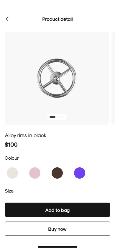
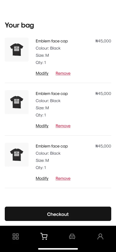
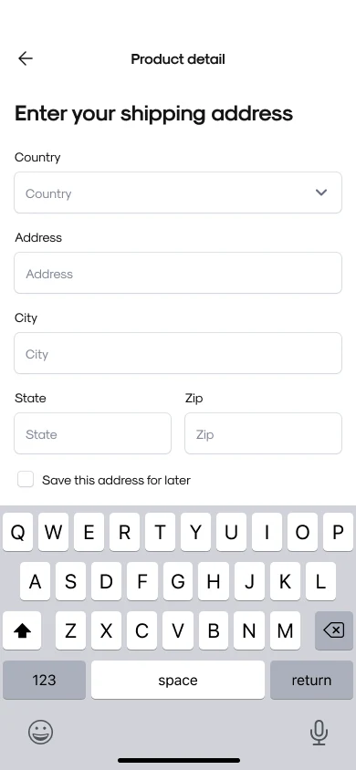
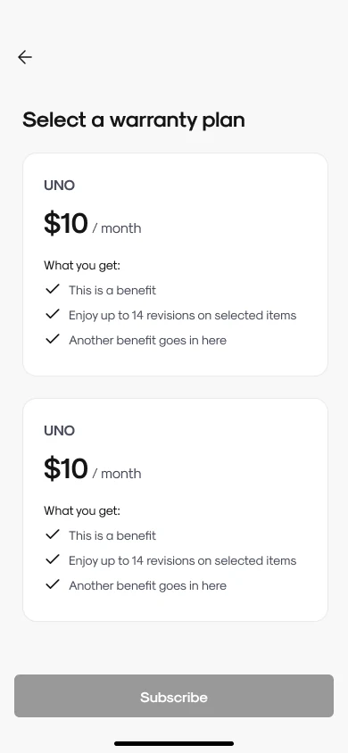
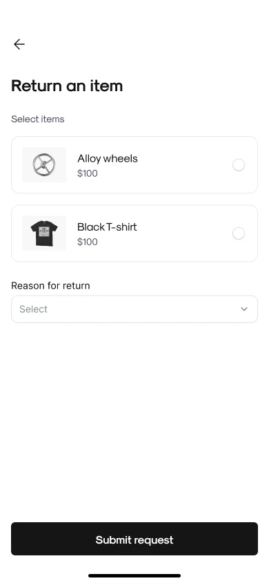
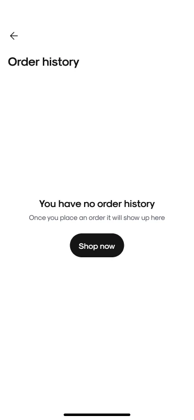
The app carries the relationship after the sale: sign up, the Kit Shop, orders and returns, warranty plans and claims, and the configurator on mobile, with guest checkout and clear states for pending payments and cancelled orders.
Mobile appScreensThe mobile app screens. - 04
Operations: admin portal and factory ERP
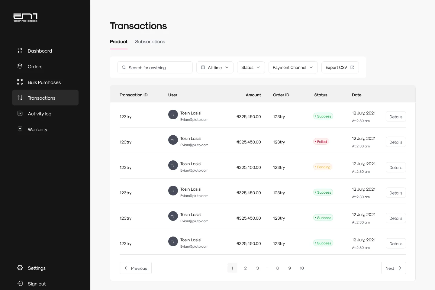
The admin portal runs orders, bulk purchases, transactions, products, support, logistics and warranty claims, with two-factor sign-in and role-based access.
AdminDashboard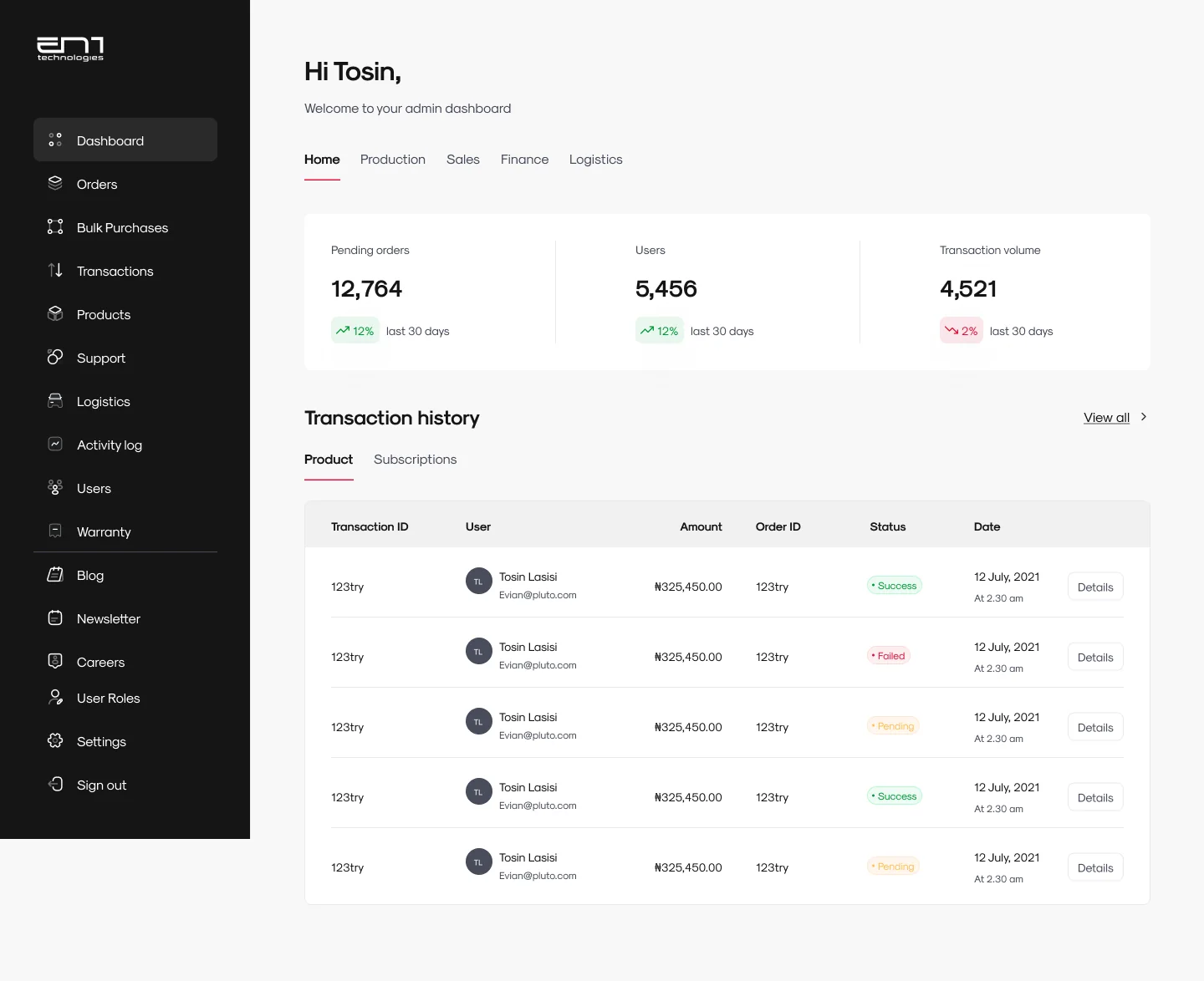
The dashboard: orders, users and transaction volume. AdminWarranty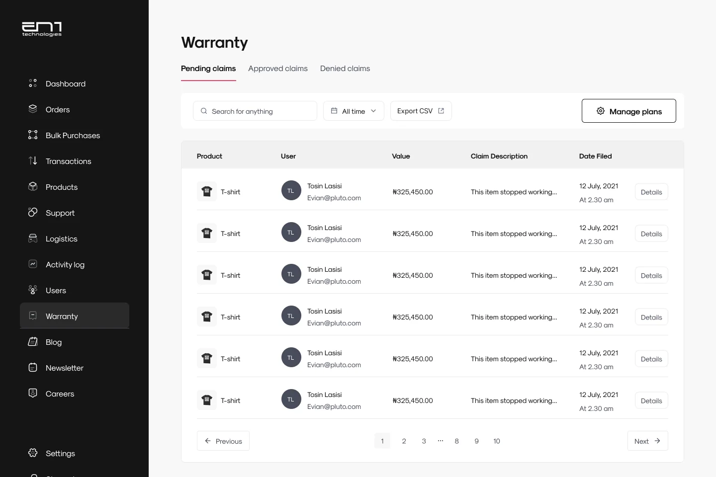
Warranty claims, by status. The factory ERP goes further. Procurement covers requisitions through purchase orders, contracts, invoicing, inventory, suppliers, spend and budget, and audit, with different access for admins and creators. Maintenance covers machines, work orders, spare parts, maintenance strategy and downtime tracking.
Factory ERPProcurement dashboard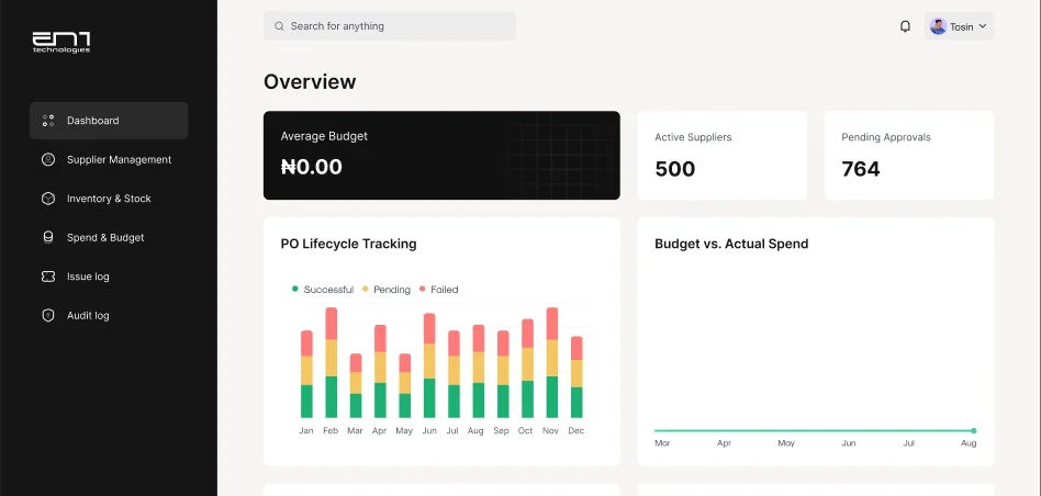
The procurement dashboard: budget, suppliers, purchase order lifecycle and spend. Factory ERPMaintenance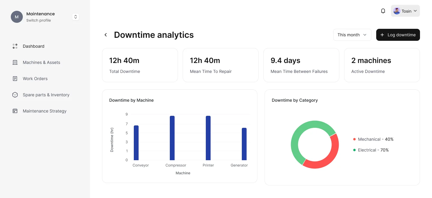
Maintenance: downtime by machine and category, with mean time to repair and mean time between failures. - 05
One design system
A shared set of components, forms, icons, colour and states means a decision made once shows up on the website, in the app, in the car and in the factory tools.
03 Judgement calls
The calls that weren’t obvious.
Three decisions on the car screen, and what each cost.
- 01
Climate on a fixed bar, not in a menu
The constraintA fixed bar takes space from the map.
What I choseClimate, seat, fan, defrost and volume on one bar that never moves.
WhyA premium car should feel effortless, so the controls reached for most stay put. The map gives up some space for that.
- 02
Speed shown larger than everything else
The constraintThe driver panel is narrow and shares the screen with the map.
What I choseSpeed in the largest type, with gear and battery small above it.
WhyEN1 sells performance, so the screen leads with how the car is doing right now. Everything else steps back.
- 03
Keyboard and search kept for parked use
The constraintSearch and typing take attention and half the screen.
What I choseTyping and destination search treated as a parked task.
WhyA premium car keeps your eyes on the road, at the cost of some convenience while moving.
Design review
I reviewed the screens against the 2013 NHTSA driver-distraction guidelines, which recommend glances of about two seconds or less and a total of about twelve seconds for a task, and against basic legibility checks. This is a self-review of the design, not user testing.
- Taps. Changing the climate or volume takes one tap, and opening an app takes two. Nothing the driver does often needs a keyboard.
- Contrast. Measured from the screens, speed reads at about 18:1, and the lowest are the secondary labels, km/h at about 5.0:1 and battery at about 4.6:1. All clear the 4.5:1 minimum for normal text, but those two are closest to it and are the first to check in direct sun.
- One inconsistency, fixed. The keyboard screen first showed the car at 57 km/h, which broke the rule that typing is for when the car is parked. It now shows the car parked.
Not tested yet
The project is ongoing and I left before the screen was tested in a vehicle, so these are design judgements, not test results. Before it goes in a car, I would test:
- Glance time to read speed, change the climate or open an app.
- Readability in direct sun and at night.
- Reach to the fixed bar in a moving car.
- Performance of the map and lane view on the car’s hardware.
Working with the car engineers
About five car engineers were on the team. I built the screen as a clickable prototype so they could review it early, while the design could still change.
04 More of the work
More of the finished screens.
The app
Car, admin and configurator
05 Leading the work
What I owned as design manager.
Vision and goals
Defined the vision and the goals for each surface.
Team
Mentored the designers and kept collaboration tight across design, software and car engineering.
Stakeholders
Aligned executive input across the project.
Quality and process
Reviewed designs for consistency and brand fit, and kept workflows efficient across six surfaces.
Designing the showroom, the car and the factory together taught me that a car brand is one experience with many screens. Decisions made once, in the system, carry everywhere.
06 Where it stands
One brand, from the showroom to the factory.
- Website and configurator, for exploring the Ultra and Ultra Lite and joining the waitlist.
- Mobile app and Kit Shop, with orders, returns and warranty.
- In-car infotainment, as a clickable prototype for the vehicle display. The project is ongoing.
- Admin portal, for orders, transactions, support and warranty claims.
- Factory ERP, for procurement and maintenance.
- One design system across all of it.